Lana Pet
"Lana Pet" v1.0.0 Documentation by "Lana Codes"
Introductory
"Lana Pet" is a modern Bootstrap framework based HTML theme. It's a 12 grid responsive theme, optimized for tablets and phones. This is the right theme for a blog or a simple website.
The theme includes the following:
- Dropdown Bootstrap Navigation Menu - Smartmenus
- Custom Bootstrap - SCSS
- Custom Theme - SCSS
- Custom Background Images - Pexels, Unsplash
- Sliders - Swiper
The theme includes the following Fonts:
- Montserrat Font - (Google Fonts)
- Open Sans Font - (Google Fonts)
It has been tested on the following browsers:
- Firefox
- Google Chrome
- Opera
- Internet Explorer
You must enable JavaScript in your browser to use this theme.
Support
If you have any more questions, feel free to contact us at: https://lana.codes/contact-us/
Created: 10/10/2019
By: Lana Codes
E-mail: [email protected]
Installation (Optional)
Gulp installation is optional. You need it if you want to change the code with SCSS.
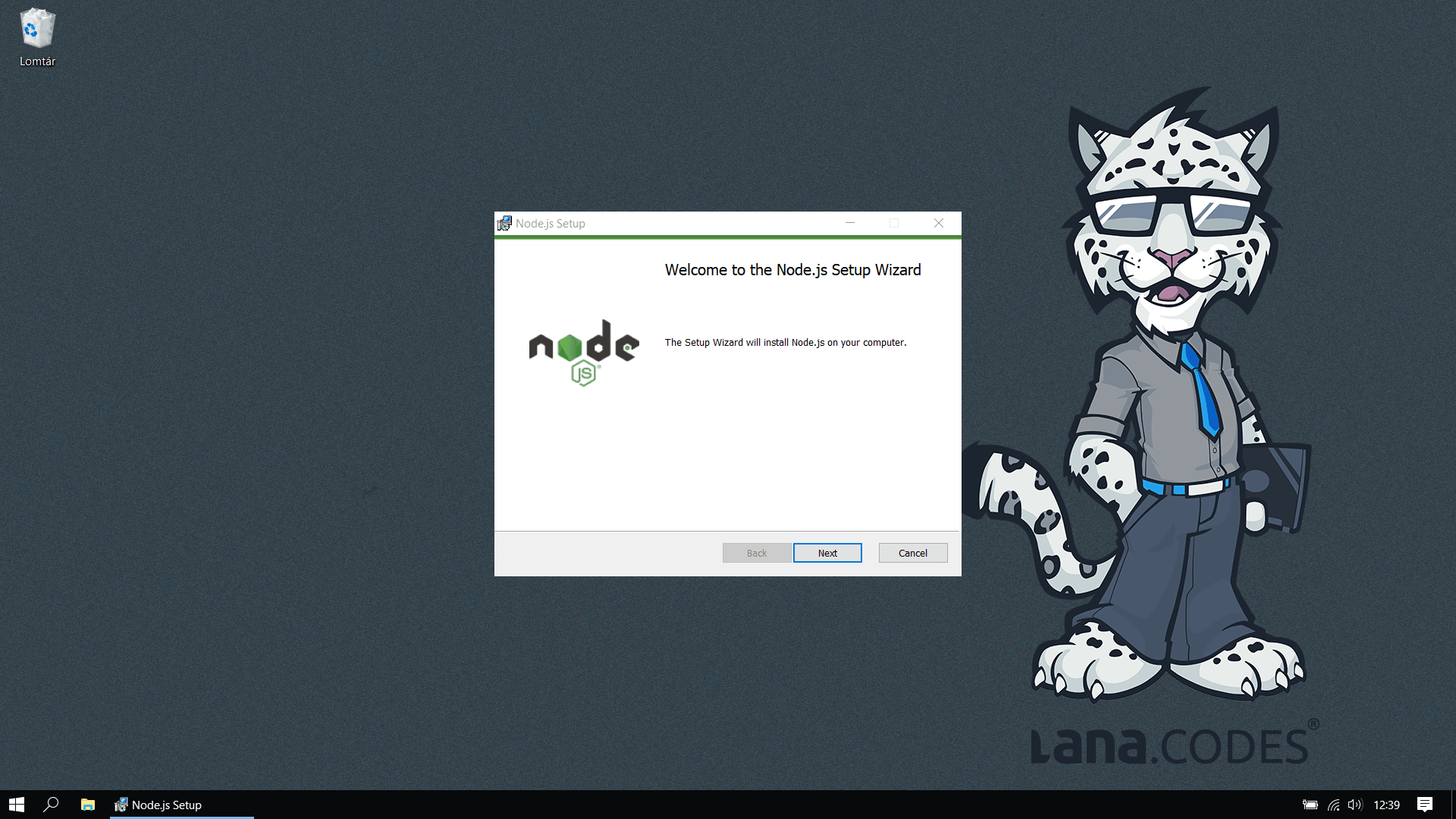
1. Install Node.js
Download Node.js installer from https://nodejs.org/en/download/.
Install it on your system.
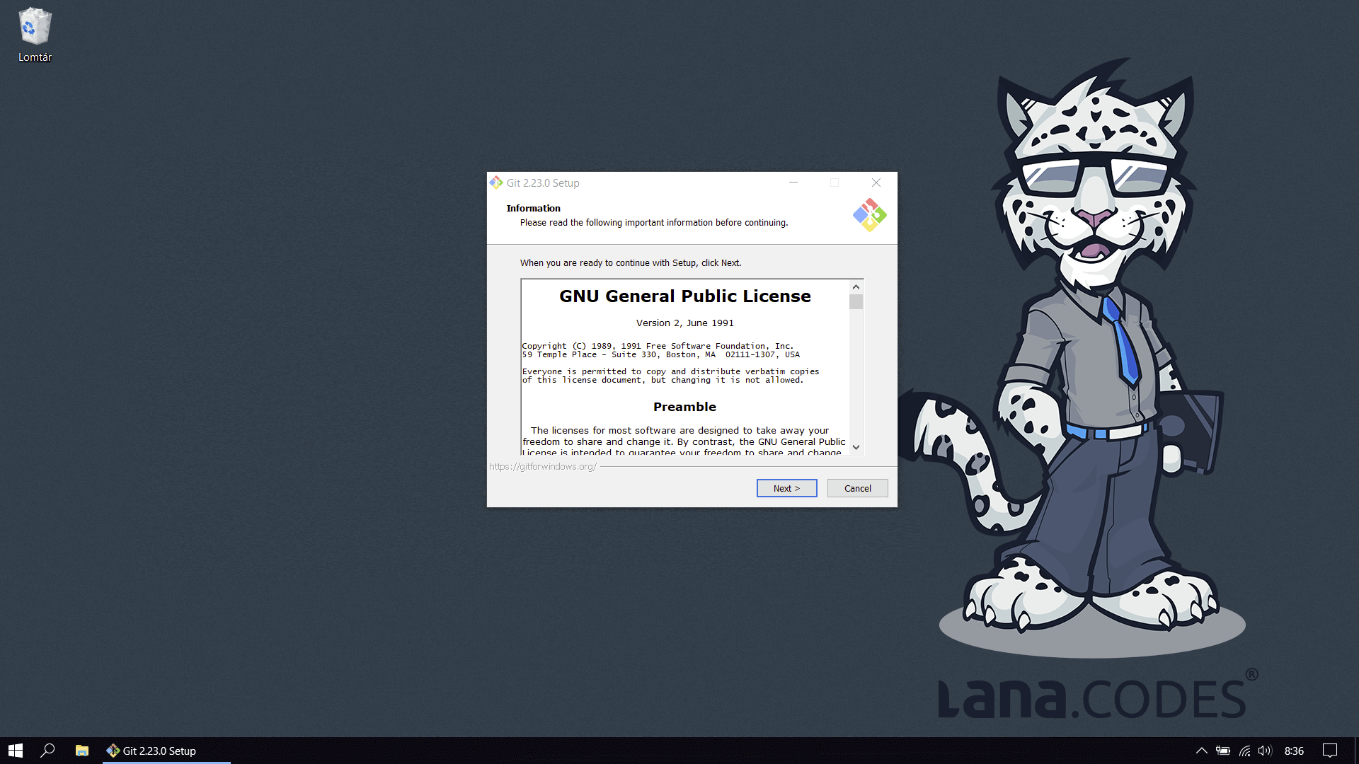
2. Install Git
Download Git installer from https://git-scm.com/download/.
Install it on your system.
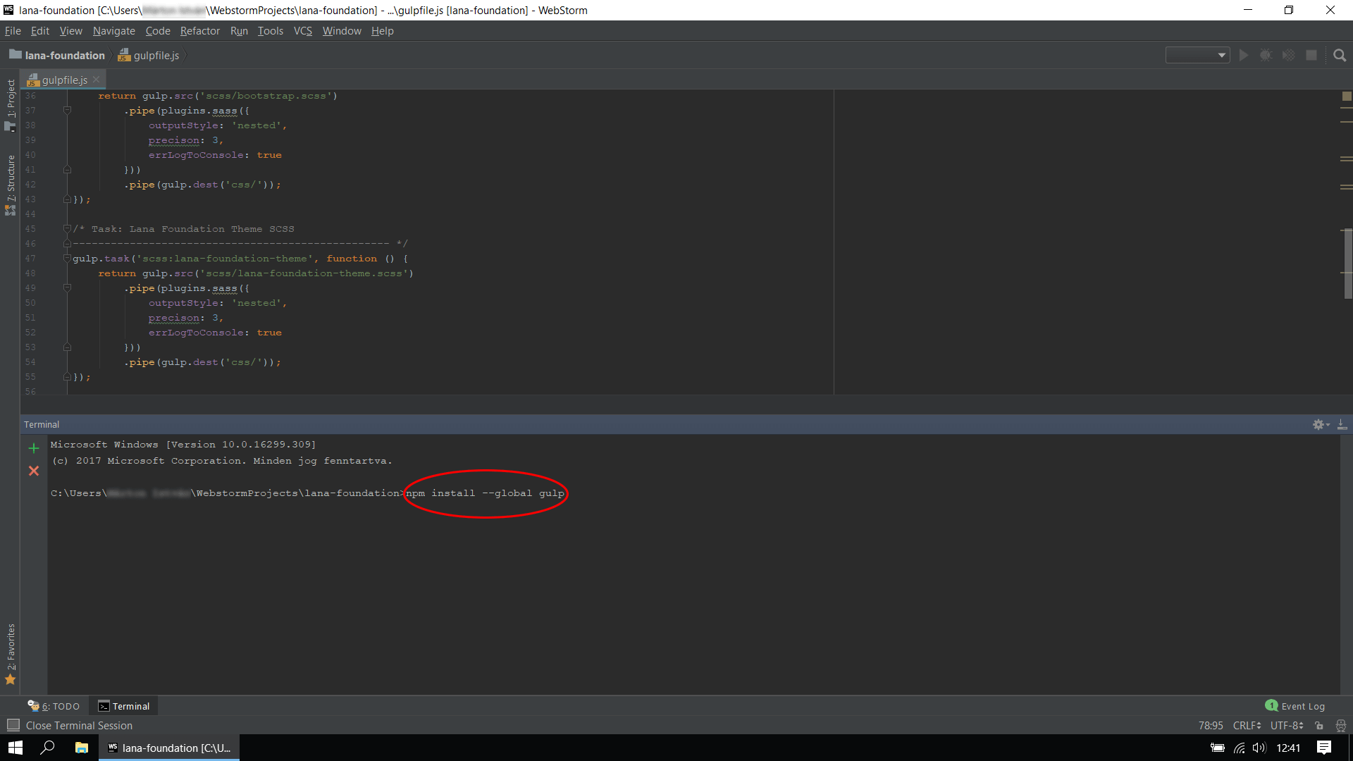
3. Install Gulp
Gulp is a command line tool, so you should be familiar working in terminal.
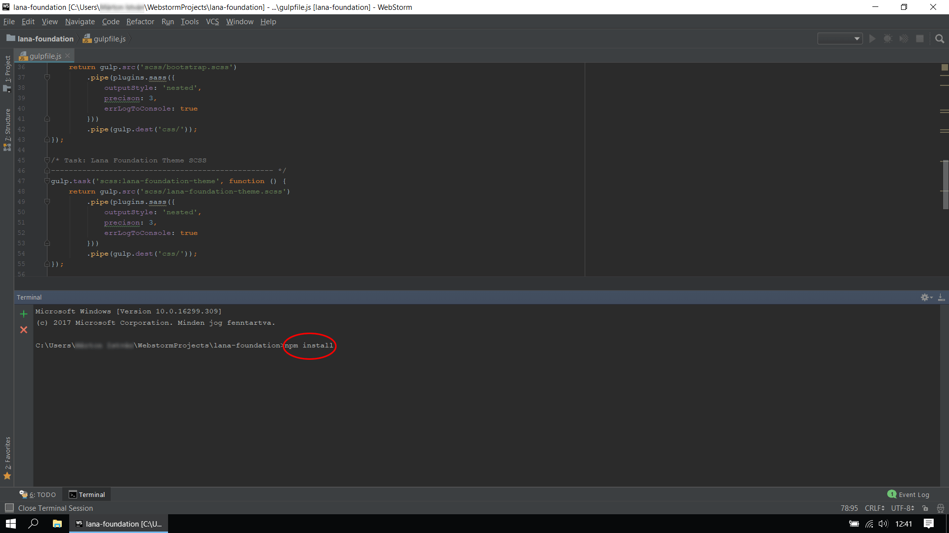
4. Install NPM modules
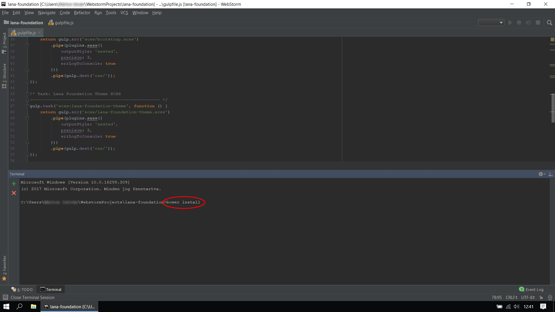
5. Install Bower components
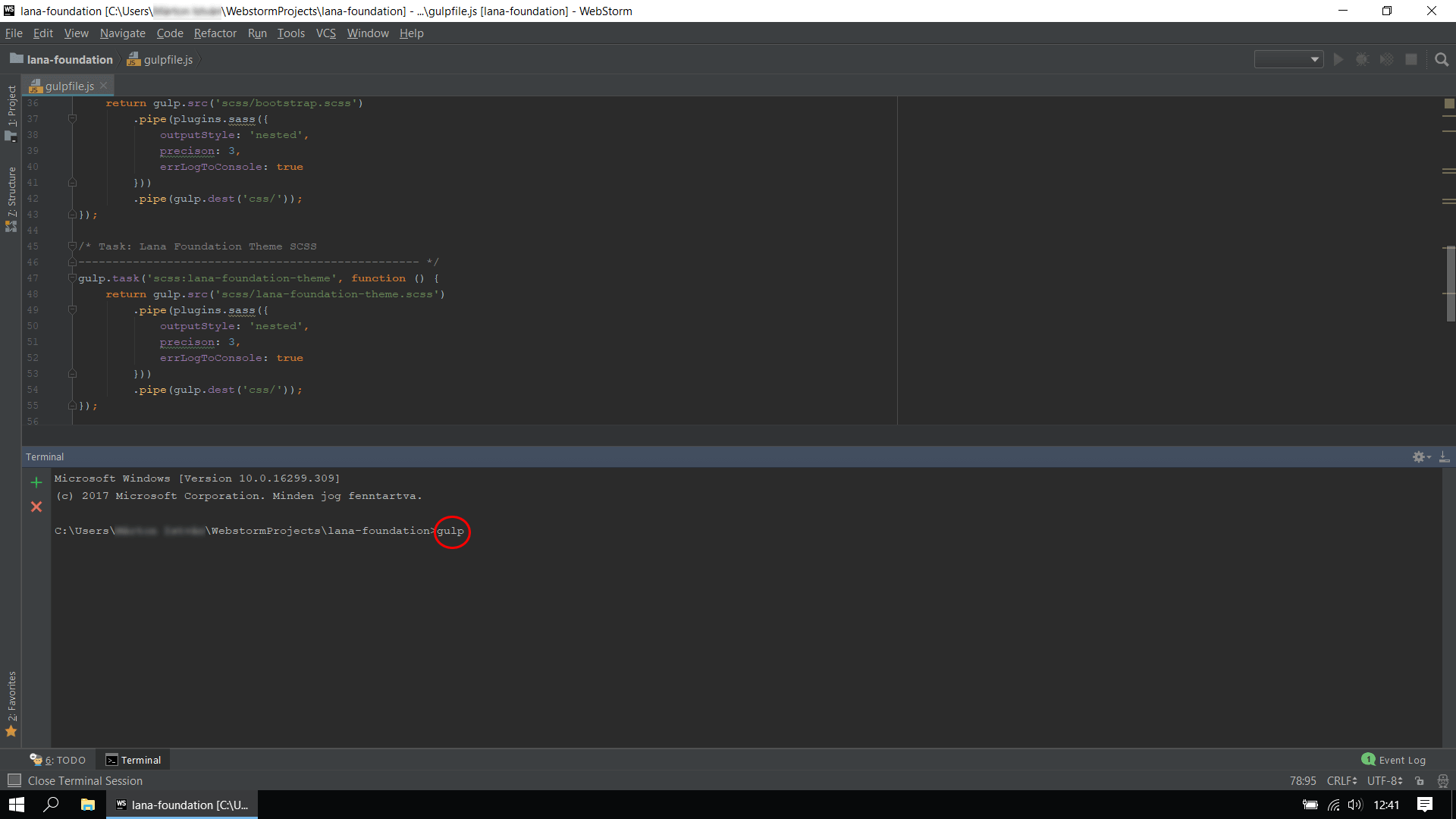
6. Run Gulp task
Files structure
/cssTemplate CSSbootstrap.cssBootstrap - most popular responsive frameworklana-pet-theme.cssLana Pet theme CSS filelana-pet-icon.cssLana Pet icon set CSS filelana-pet-print.cssLana Pet print CSS filesmartmenus-bootstrap.cssBootstrap 4 addon for SmartMenusfont-awesome.cssFont Awesome icon setswiper.min.cssSwiper - most modern responsive slideranimate.min.cssCSS animationsmagnific-popup.cssMagnific Popup - responsive lightbox and dialog
/imgImages/jsTemplate JavaScriptjquery.jsJavaScript librarybootstrap.jsBootstrap - most popular responsive frameworkpopper.jsRequires for Bootstrap-
custom-theme.jsMain Javascript file. This file have many initialization scripts for jQuery plugins. smartmenus.jsSmartMenus - responsive menusmartmenus-bootstrap.jsBootstrap 4 addon for SmartMenusscrollmagic.jsScrollMagic - magical scroll interactionsswiper.jsSwiper - most modern responsive slidermagnific-popup.jsMagnific Popup - responsive lightbox and dialog
/fontsFonts- Lana Pet icon set
- Font Awesome icon set
/scssTemplate SCSS/bootstrapBootstrap SCSS overrides/swiperSwiper SCSS overrides/theme-elementstheme elements SCSS definitions/theme-templatestheme templates SCSS definitionslana-pet-theme.cssLana Pet theme SCSS filelana-pet-icon.cssLana Pet icon set SCSS filelana-pet-print.cssLana Pet print SCSS file
HTML structure
The template is based on Bootstrap 4 Framework.
The Bootstrap is a responsive, mobile first fluid grid system, which is divided into 12 columns. With the columns you can change the structure, depending on the viewport.
                        <div class="row">
                            <div class="col-md-4">
                                One of three columns
                            </div>
                            <div class="col-md-4">
                                One of three columns
                            </div>
                            <div class="col-md-4">
                                One of three columns
                            </div>
                        </div>
Visit https://getbootstrap.com/docs/4.4/layout/grid/ for more information and description.
The HTML template is built on WordPress standard, so it is compatible with WordPress. Includes WordPress default classes, elements and structure.
                        <body class="archive">
                            <div id="post-1" class="post type-post post-1">
                                WordPress #1 Post content
                            </div>
                            <div id="post-2" class="post type-post post-2">
                                WordPress #2 Post content
                            </div>
                        </body>
CSS structure
The template contains 3 different main CSS files:
/css/lana-pet-theme.css
Lana Pet theme, that includes theme elements, theme templates and effects.
It's a file generated from SCSS, so it's not structured and commented.
/css/lana-pet-icon.css
Lana Pet icon contains a unique icon set.
This icon set is related to animals.
Example usage:
<span class="lpi lpi-dog lpi-5x"></span>
The full list of icons can be found in the lana-pet-icon.html file in the template.
Or online at https://lana.solutions/lana-pet-html/html/lana-pet-icon.html.
/css/lana-pet-print.css
Lana Pet print includes a complement to the print style.
This style is used only for printing.
SCSS structure
/scss/bootstrap/_variables.scss
This file contains Bootstrap variable overrides.
                        // colors
                        $orange: #ff8a00;
                        $yellow: #e7af09;

                        // bootstrap colors
                        $primary: $orange;

                        // fonts
                        $font-family-sans-serif: 'Montserrat', sans-serif;
                        $font-family-secondary-sans-serif: 'Open Sans', sans-serif;
These override the Bootstrap !default values according to the template style.
Visit https://getbootstrap.com/docs/4.4/getting-started/theming/ for more information and description.
/scss/theme-elements/_post-type.scss
/scss/theme-elements/_post.scss
/scss/theme-elements/_{post-type-name}.scss
/scss/theme-elements/_navbar.scss
                        // post
                        .post.type-post {

                            // post with post card
                            &.post-card {
                                // scss style values
                            }
                        }
Definitions of WordPress standard elements and other theme elements. You can also find comment, pagination and widgets definitions. As Bootstrap compatible templates, so each element using Bootstrap variables.
/scss/theme-templates/_archive.scss
/scss/theme-templates/_single.scss
/scss/theme-templates/_{template-name}.scss
                        // archive.html
                        body.blog,
                        body.archive {

                            // blog posts with post card
                            .blog-posts {
                                // scss style values
                            }
                        }
Define the style of the template files. Since these are template files overrides, they are
assigned to the class specified in the <body> tag.
Page
The "Lana Pet" theme includes the following page templates:
- Front Page
- Default Page
- Our Services Page
- Our Partners Page
- Our Team Page
- Contact Page
Other templates:
- 404 Error Page
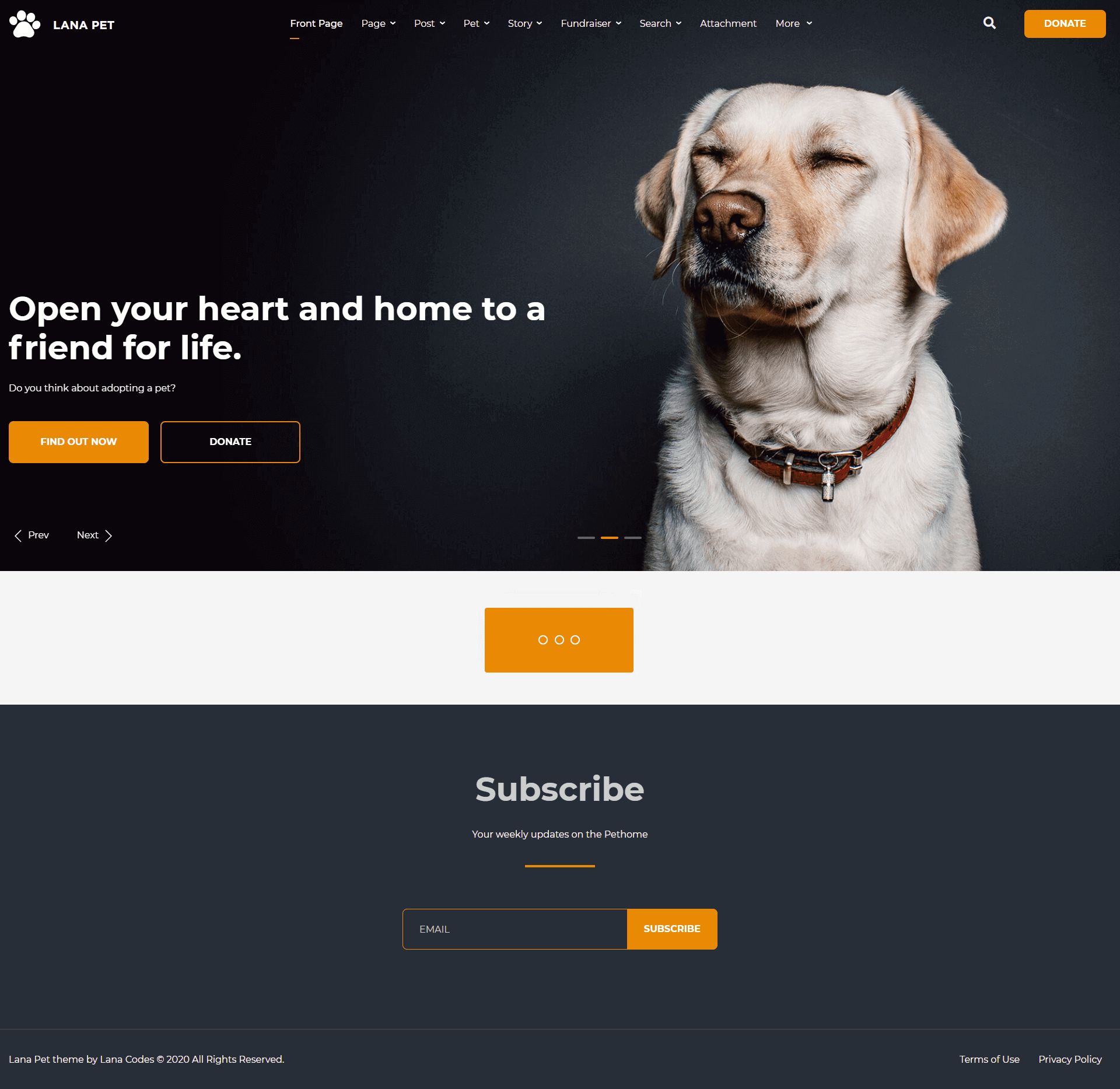
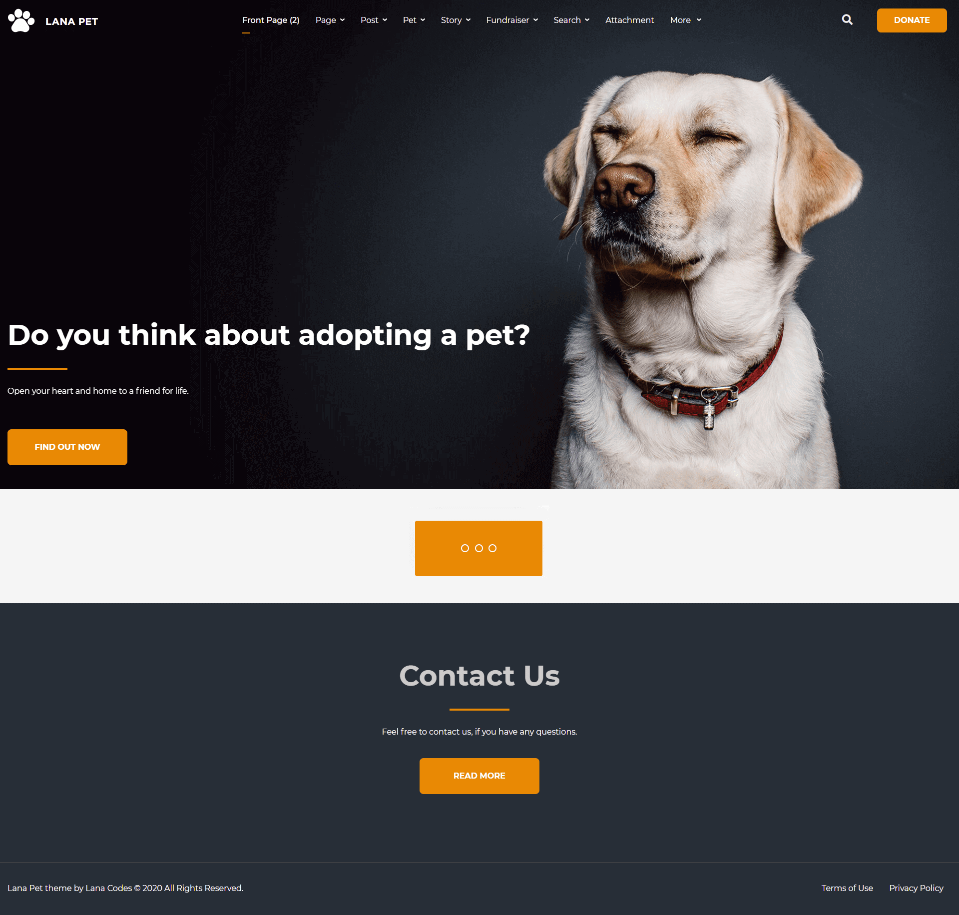
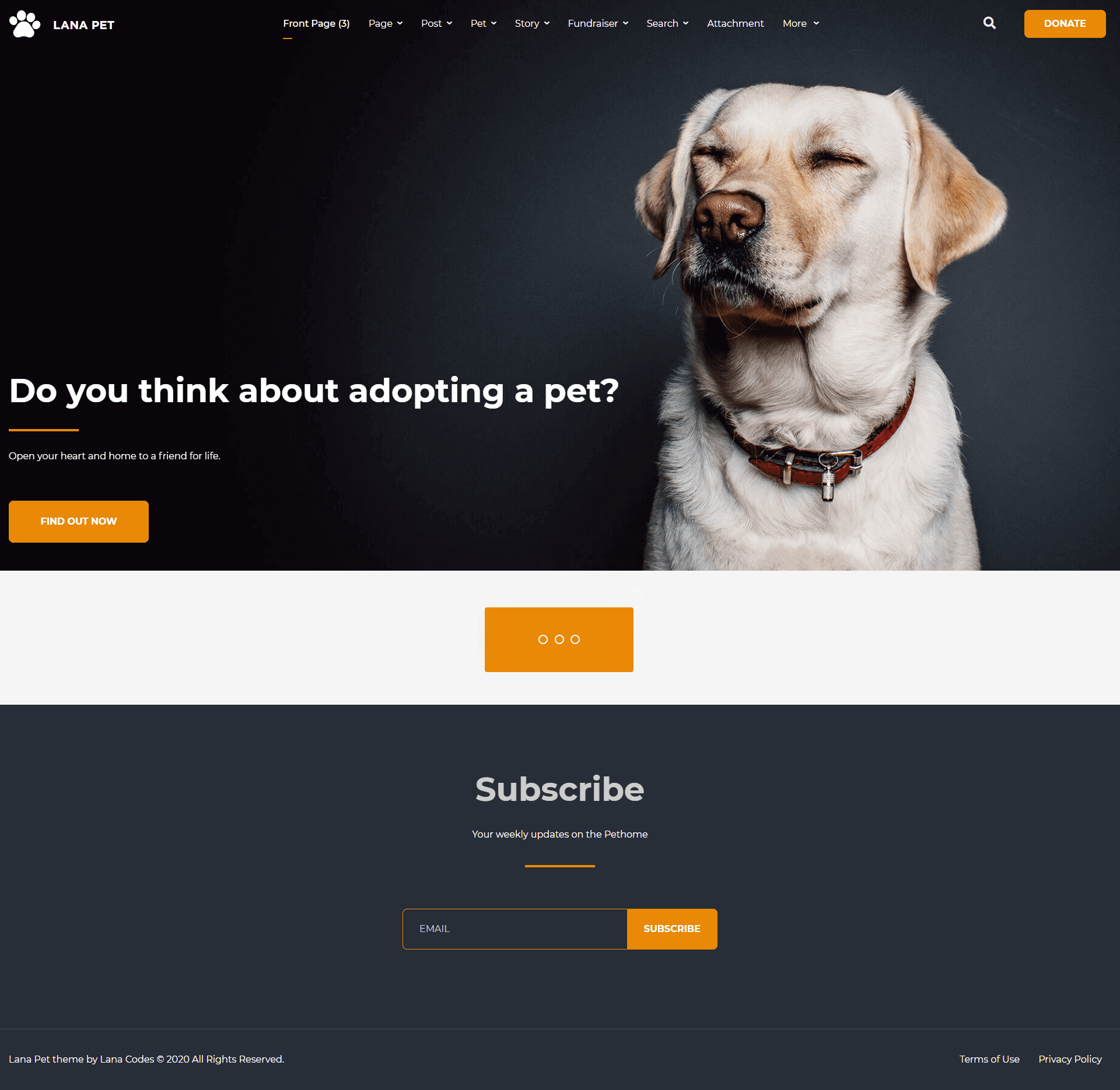
Front Page (Landing)
The Front Page template is a full-width page.
The landing page contains several sections.
The main sidebar won't appear.
Important classes for the front-page.html:
                                <body class="home page">
                                    <!-- body content -->
                                </body>
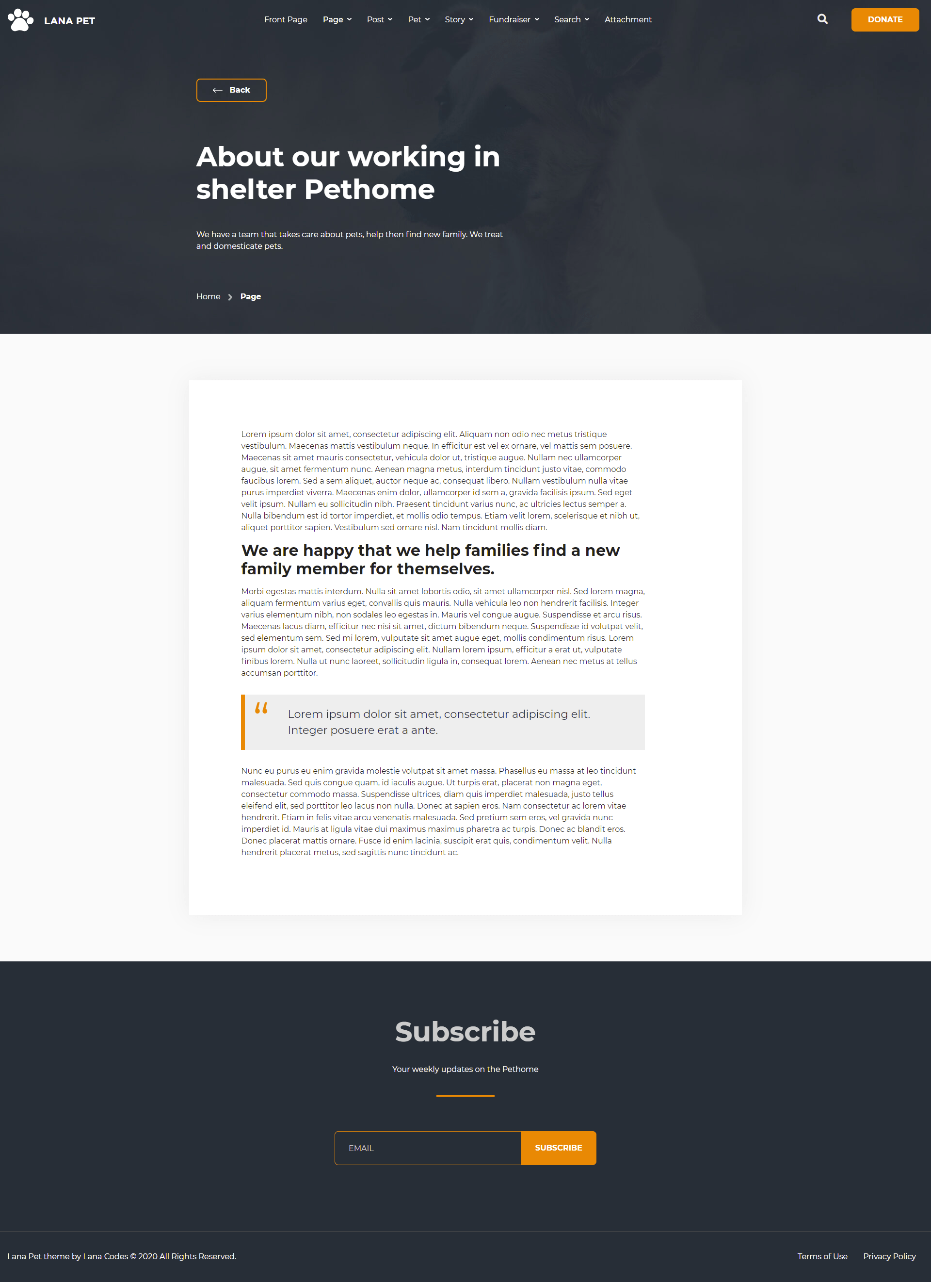
Default Page
The Default Page template is a full-width page.
The main sidebar won't appear.
Important classes for the page.html:
                                <body class="page page-template-default">
                                    <!-- body content -->
                                </body>
and the html tag of the post that contains the content:
                                <div id="post-1" class="page type-page post-1">
                                    <!-- page content -->
                                </div>
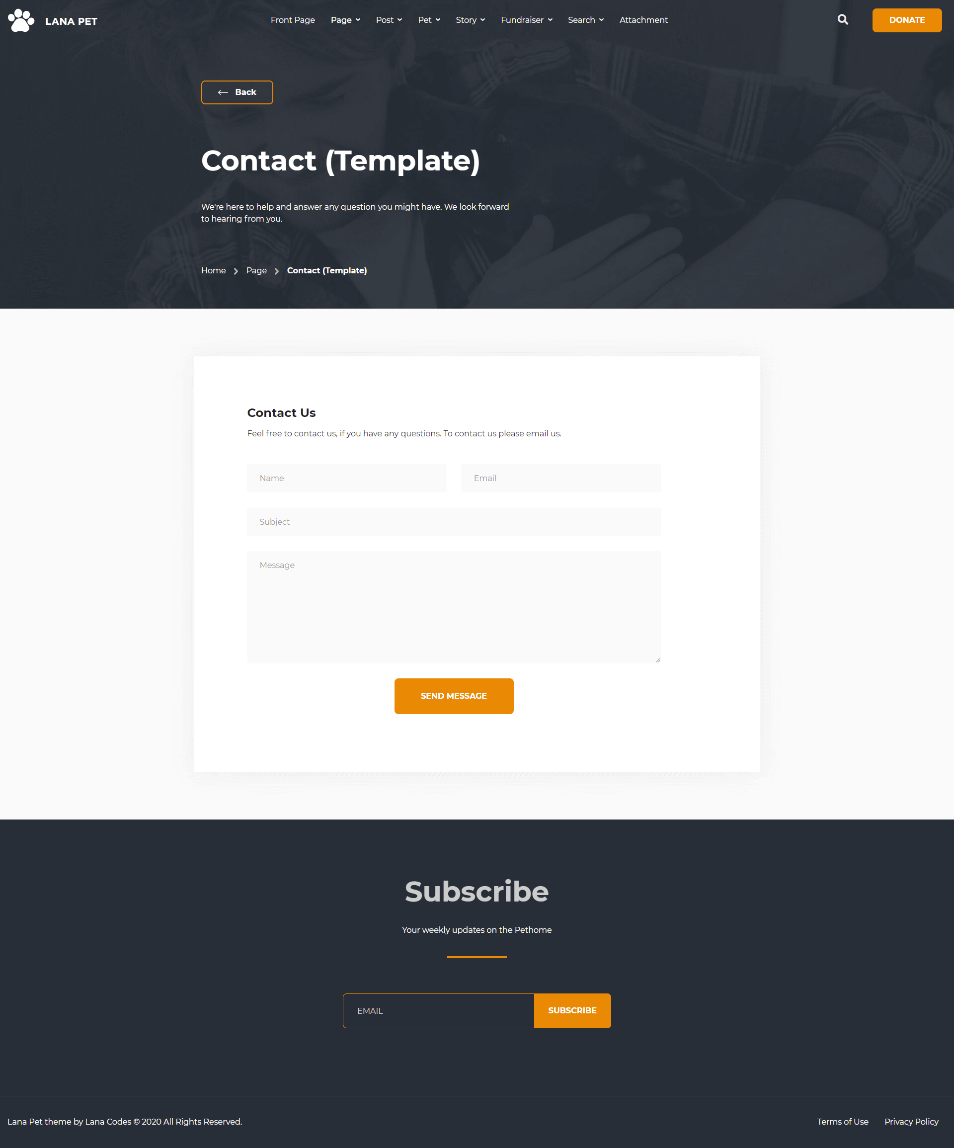
Contact Page
The Contact Page template includes a contact form.
The content appears in full width.
The main sidebar won't appear.
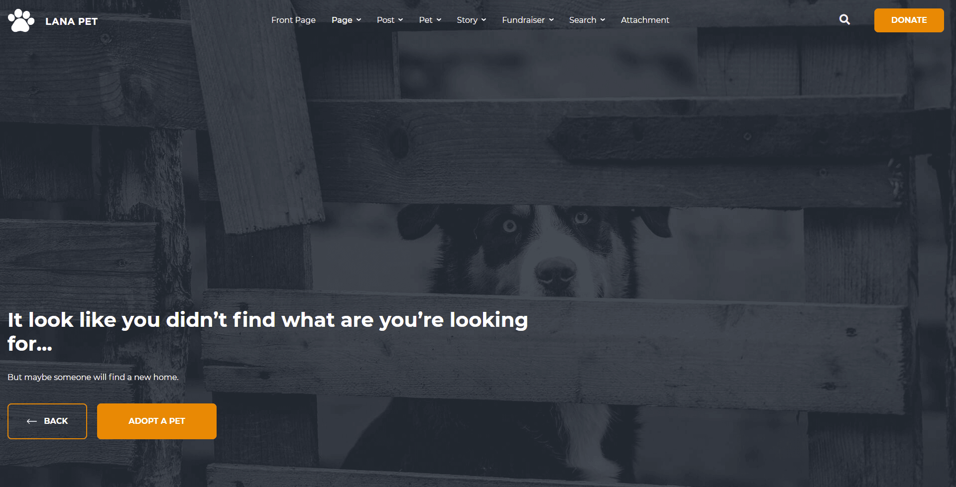
404 Error Page
Post
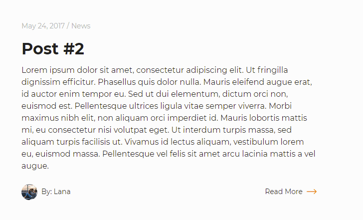
Archive
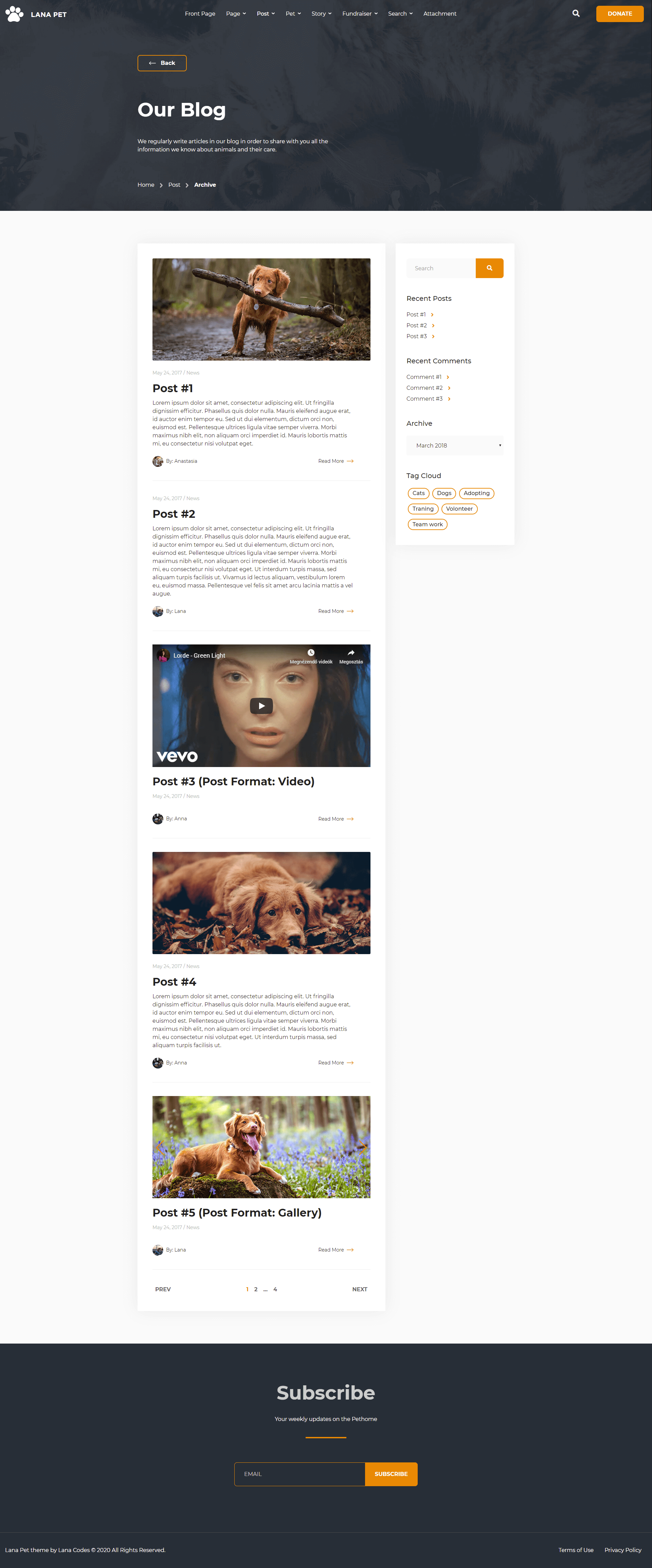
The main sidebar appears on the right.
The featured image is optional for post.
Important classes for the archive.html:
                                <body class="archive with-sidebar">
                                    <!-- body content -->
                                </body>
and the html tag of the posts and widgets container:
                                <div class="blog-posts">
                                    <!-- posts -->
                                </div>
                                <div class="widget-sidebar blog-sidebar">
                                    <!-- widgets -->
                                </div>
and the html tag of the post that contains the content:
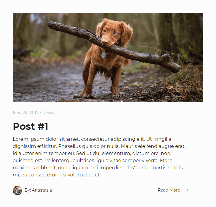
                                <div id="post-1" class="post type-post post-1 card post-card">
                                    <!-- #1 post content -->
                                </div>
                                <div id="post-2" class="post type-post post-2 card post-card">
                                    <!-- #2 post content -->
                                </div>
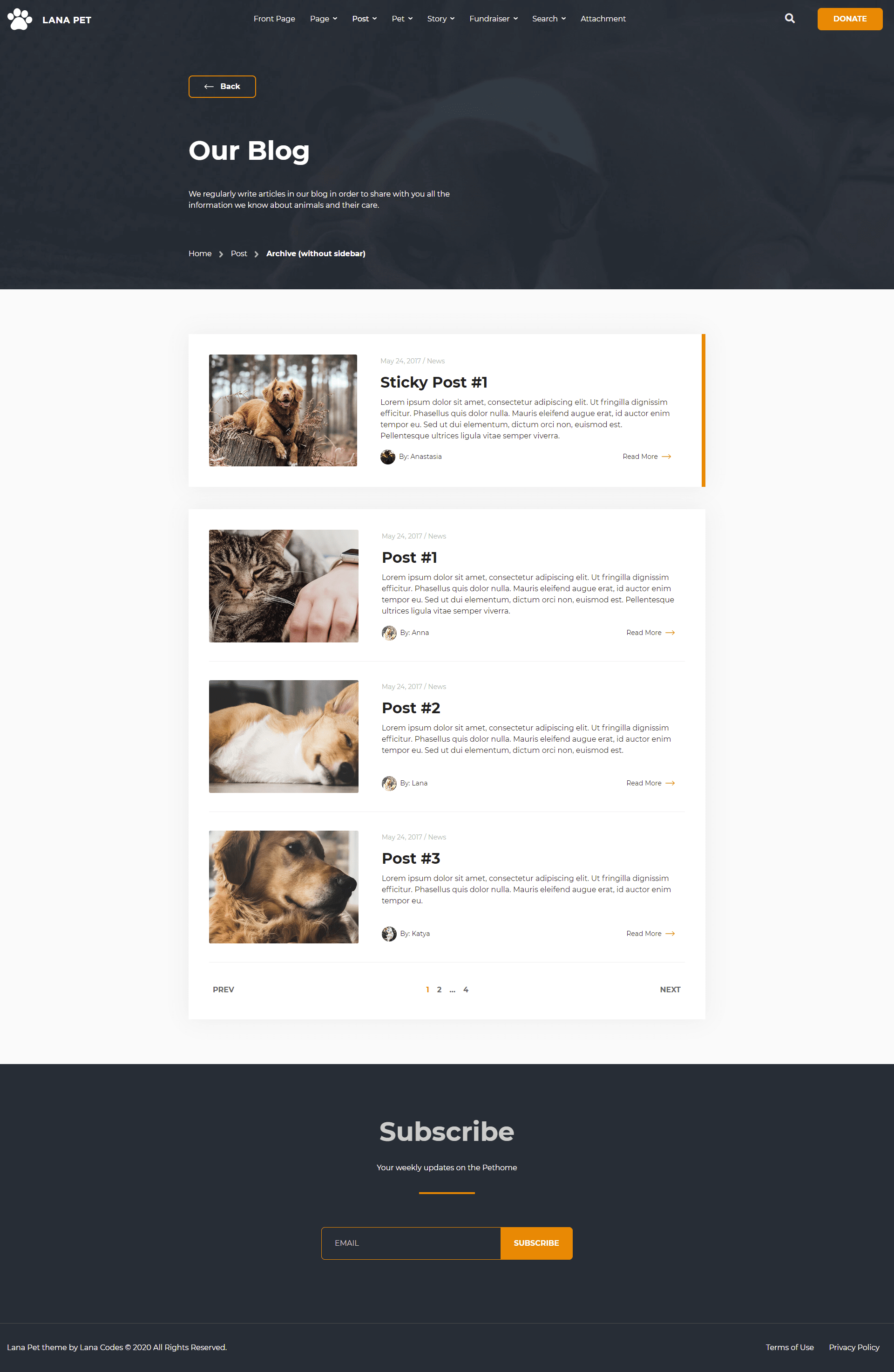
If there is no main sidebar, the content appears in full width.
In this case, the structure of the post will change:
- The featured image on the left side of the content.
- Featured image is required. If not set, a placeholder image can be used.
Important classes for the archive-without-sidebar.html:
                                <body class="archive without-sidebar">
                                    <!-- body content -->
                                </body>
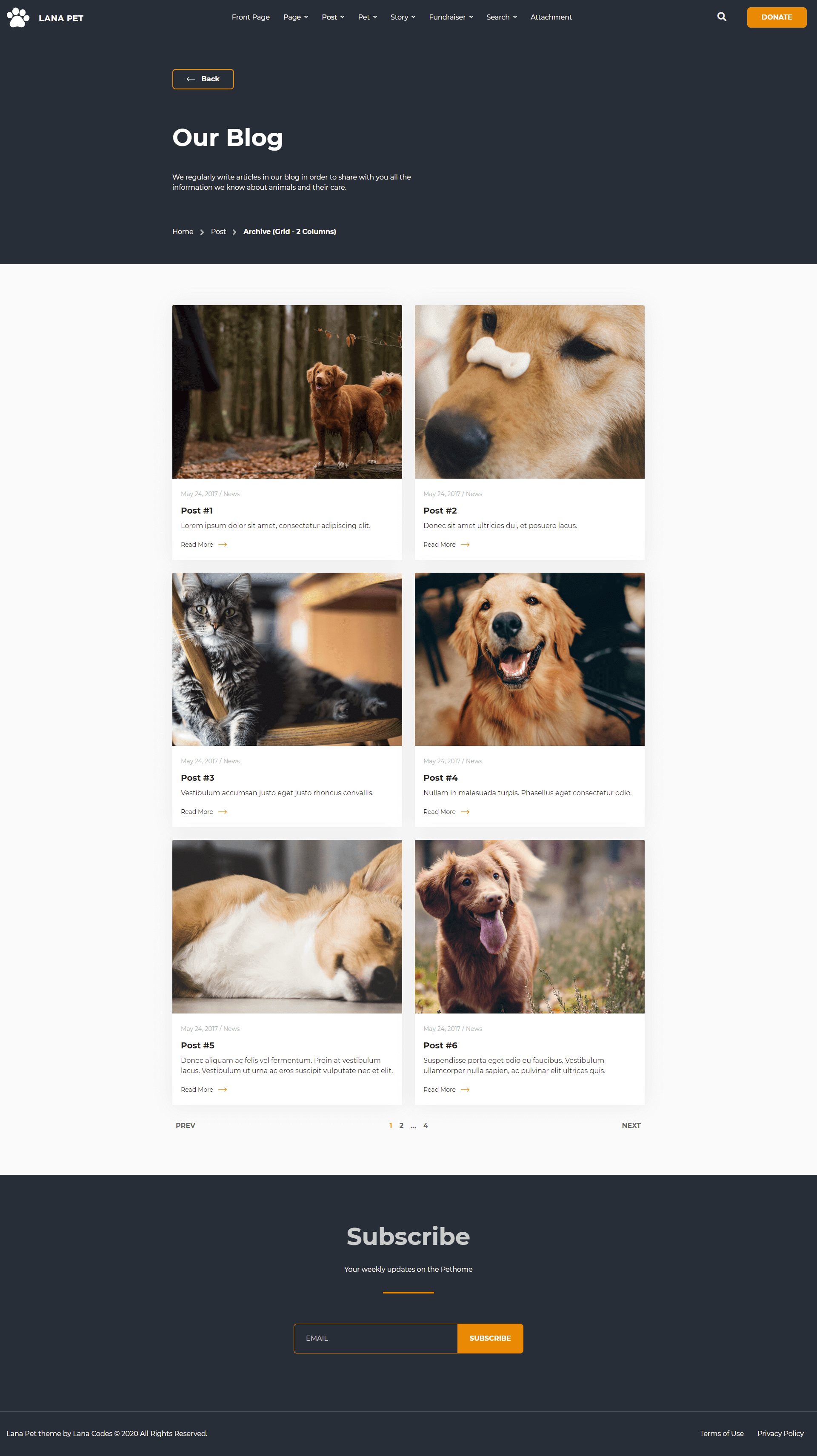
The Archive - Grid with 2 Columns is a full-width page.
In this case, the structure of the post will change:
- The featured image on the top of the content.
- Featured image is required. If not set, a placeholder image can be used.
- The author of the post won't appear.
Important classes for the archive-grid-2-columns.html:
                                <body class="archive grid-2-columns">
                                    <!-- body content -->
                                </body>
and the html tag of the posts container:
                                <div class="blog-grid-posts">
                                    <!-- posts -->
                                </div>
and the html tag of the post that contains the content:
                                <div class="blog-grid-col col-12 col-md-6">
                                    <div id="post-1" class="post type-post post-1 card post-card post-grid-card h-100">
                                        <!-- #1 post content -->
                                    </div>
                                </div>
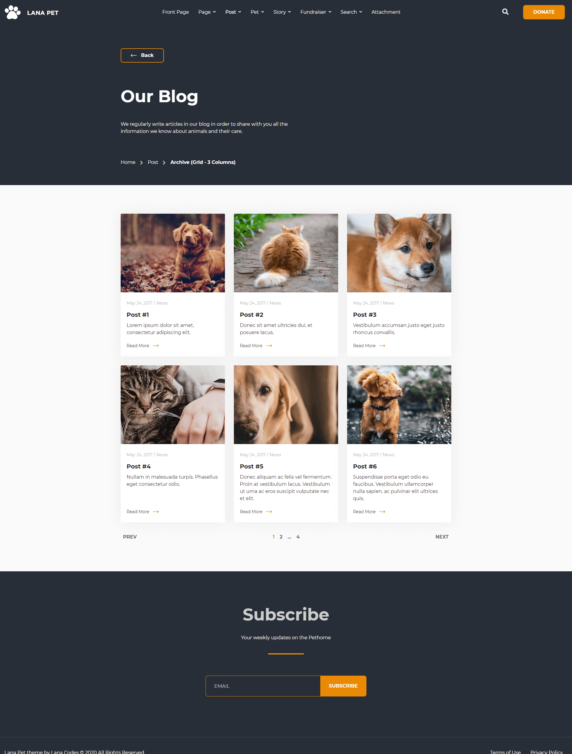
The Archive - Grid with 3 Columns is a full-width page.
In this case, the structure of the post will change:
- The featured image on the top of the content.
- Featured image is required. If not set, a placeholder image can be used.
- The author of the post won't appear.
Important classes for the archive-grid-3-columns.html:
                                <body class="archive grid-3-columns">
                                    <!-- body content -->
                                </body>
and the html tag of the posts container:
                                <div class="blog-grid-posts">
                                    <!-- posts -->
                                </div>
and the html tag of the post that contains the content:
                                <div class="blog-grid-col col-12 col-md-6 col-lg-4">
                                    <div id="post-1" class="post type-post post-1 card post-card post-grid-card h-100">
                                        <!-- #1 post content -->
                                    </div>
                                </div>
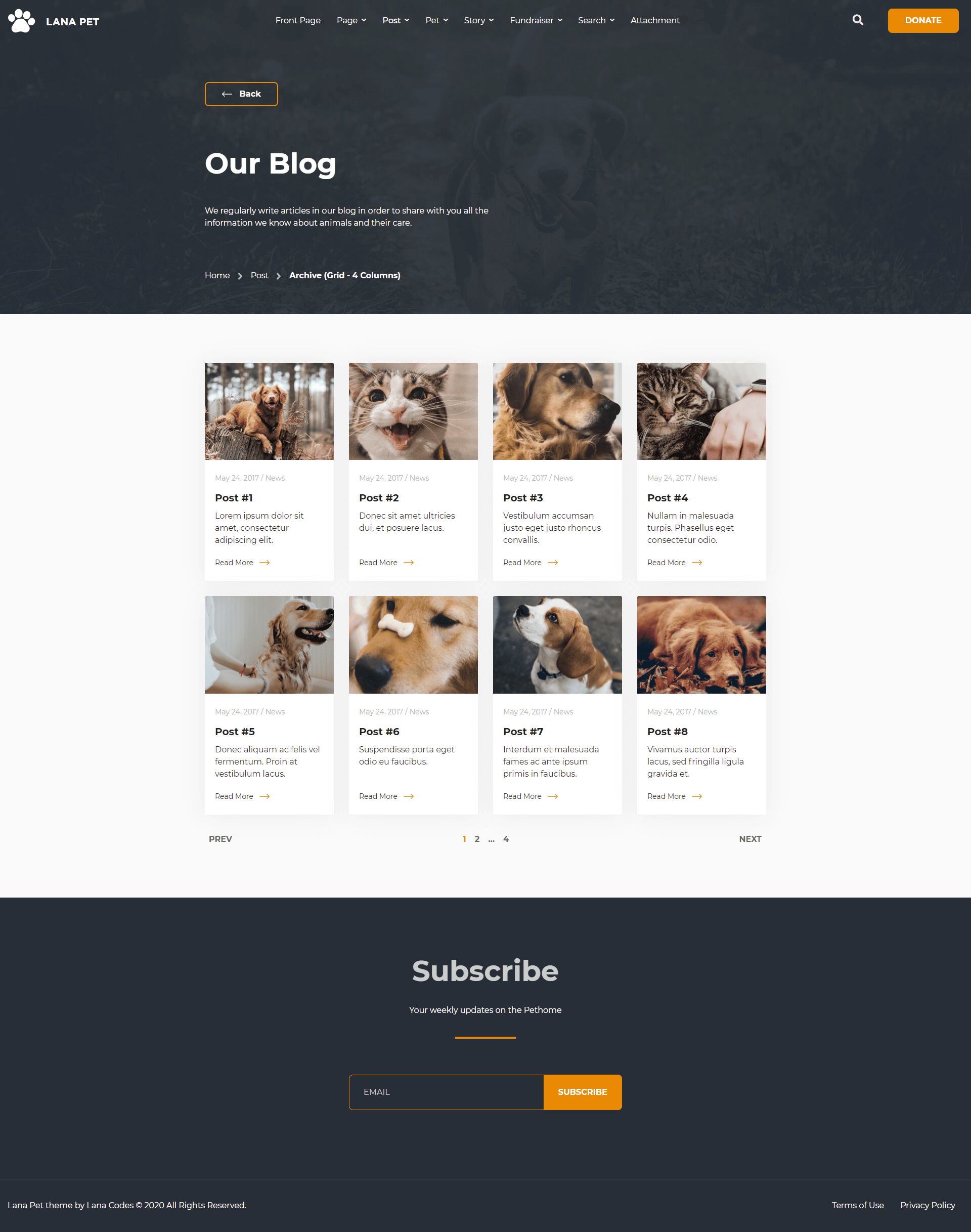
The Archive - Grid with 4 Columns is a full-width page.
In this case, the structure of the post will change:
- The featured image on the top of the content.
- Featured image is required. If not set, a placeholder image can be used.
- The author of the post won't appear.
Important classes for the archive-grid-4-columns.html:
                                <body class="archive grid-4-columns">
                                    <!-- body content -->
                                </body>
and the html tag of the posts container:
                                <div class="blog-grid-posts">
                                    <!-- posts -->
                                </div>
and the html tag of the post that contains the content:
                                <div class="blog-grid-col col-12 col-md-6 col-lg-3">
                                    <div id="post-1" class="post type-post post-1 card post-card post-grid-card h-100">
                                        <!-- #1 post content -->
                                    </div>
                                </div>
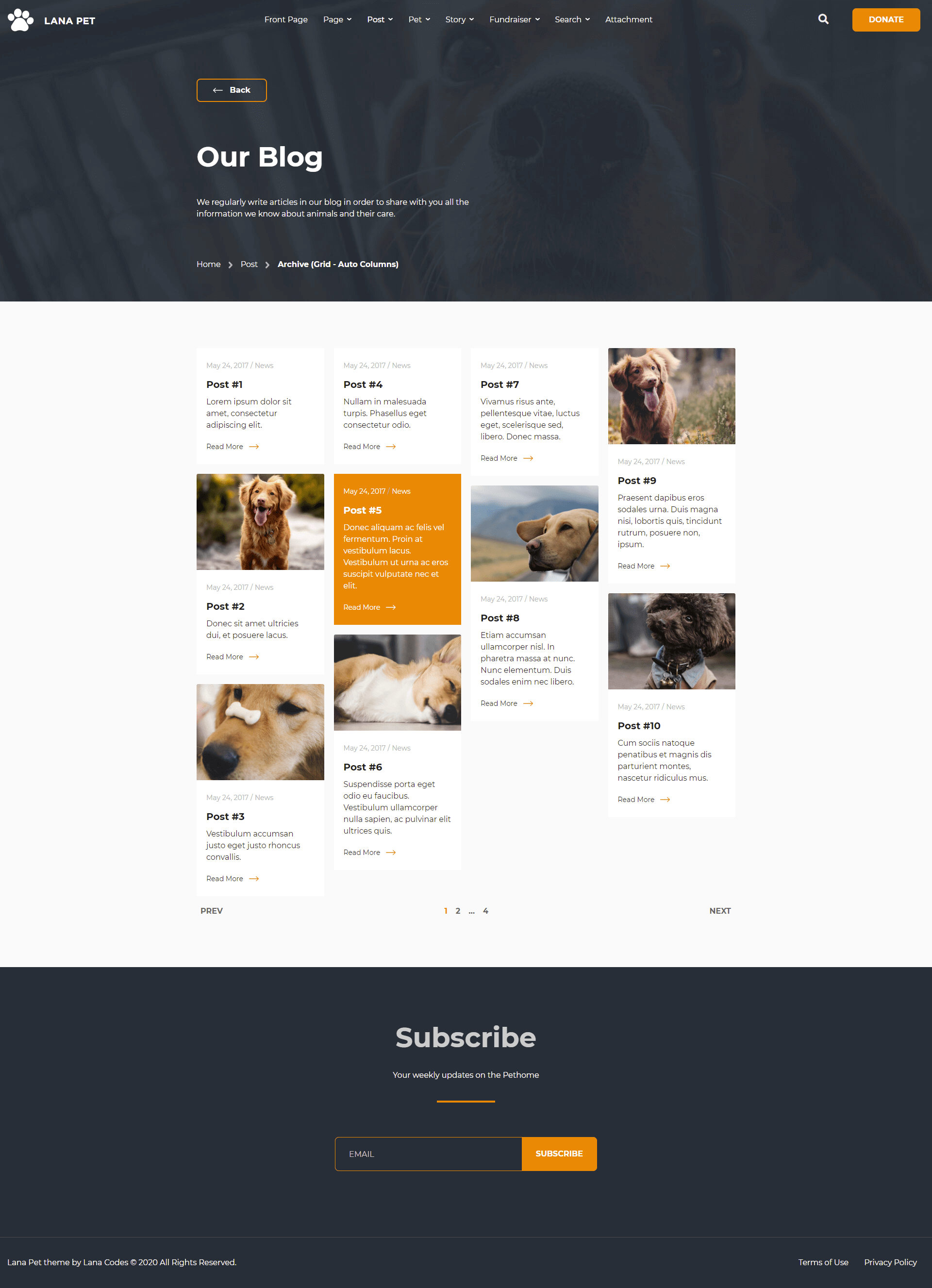
The Archive - Grid with Auto Columns is a full-width page.
Cards can be organized into Masonry-like columns with just Bootstrap based CSS.
In this case, the structure of the post will change:
- The featured image on the top of the content.
- Featured image is required. If not set, a placeholder image can be used.
- The author of the post won't appear.
Important classes for the archive-grid-auto-columns.html:
                                <body class="archive grid-auto-columns">
                                    <!-- body content -->
                                </body>
and the html tag of the posts container:
                                <div class="blog-grid-posts">
                                    <div class="card-columns">
                                        <!-- posts -->
                                    </div>
                                </div>
and the html tag of the post that contains the content:
                                <div class="blog-grid-col">
                                    <div id="post-1" class="post type-post post-1 card post-card post-grid-card h-100">
                                        <!-- #1 post content -->
                                    </div>
                                </div>
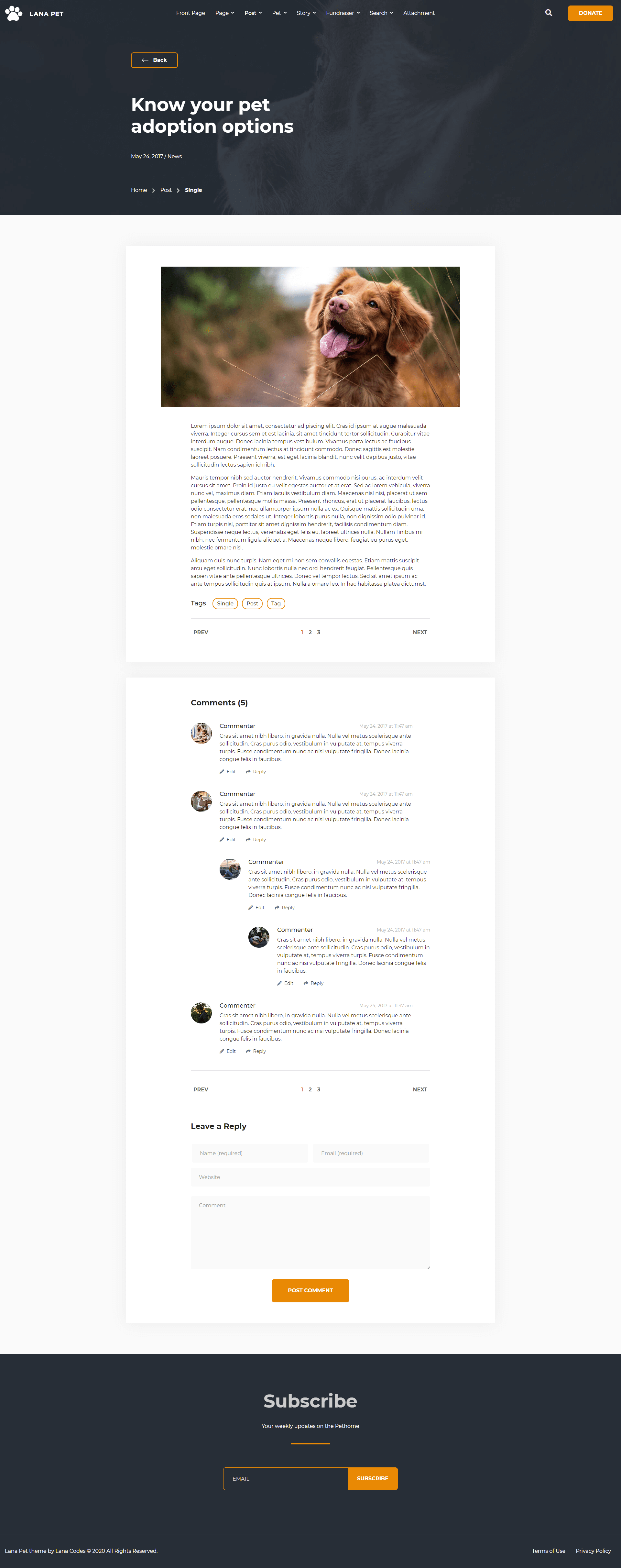
Single
The metadata is on the bottom of the title.
The Featured Image is on the top of the post, in fixed size.
The tags is on the bottom of the content.
Comments at the bottom of the post.
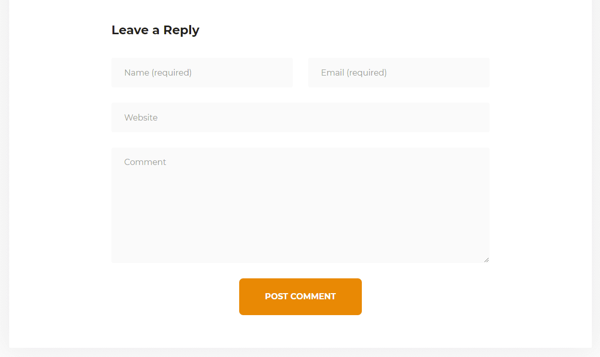
Comment Reply at the bottom of the Comments.
The main sidebar won't appear.
Important classes for the single.html:
                                <body class="single single-post">
                                    <!-- body content -->
                                </body>
and the html tag of the post that contains the content:
                                <div id="post-1" class="post type-post post-1 has-post-thumbnail comment-open">
                                    <!-- post content -->
                                </div>
The "Lana Pet" theme supports the following formats.
- Standard
The appearance of the posts changes by the formats.
Standard
Pet
The "Lana Pet" theme includes Pet custom post type.
Archive
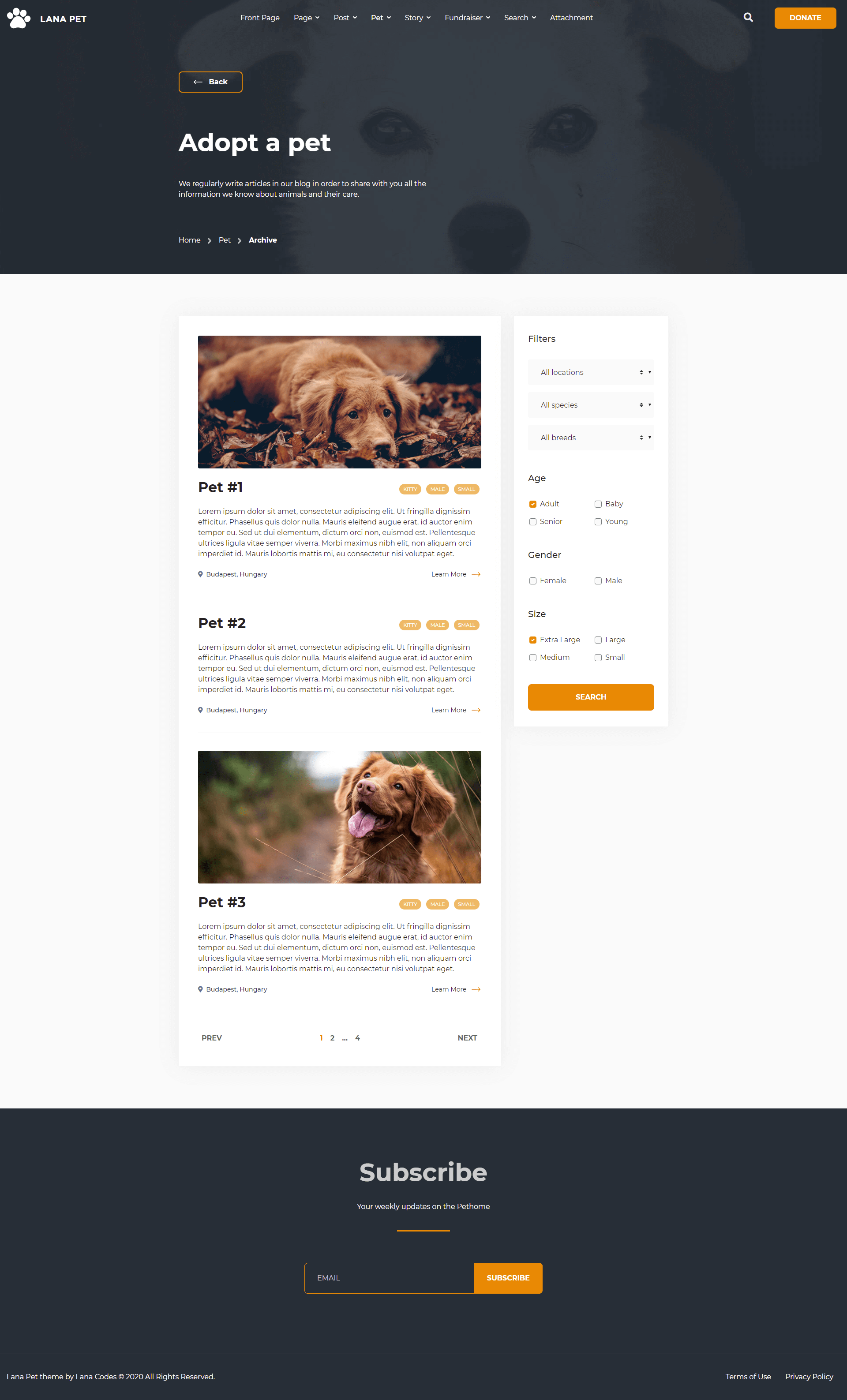
The Pet Archive is a content-sidebar structure page.
The main sidebar appears on the right. The sidebar is required to display.
The featured image is optional for pet.
Important classes for the archive-lana_pet.html:
                                <body class="archive post-type-archive post-type-archive-lana_pet">
                                    <!-- body content -->
                                </body>
and the html tag of the posts and widgets container:
                                <div class="pet-posts">
                                    <!-- posts -->
                                </div>
                                <div class="widget-sidebar pet-sidebar">
                                    <!-- widgets -->
                                </div>
and the html tag of the post that contains the content:
                                <div id="post-1" class="lana_pet type-lana_pet post-1 card pet-card">
                                    <!-- post content -->
                                </div>
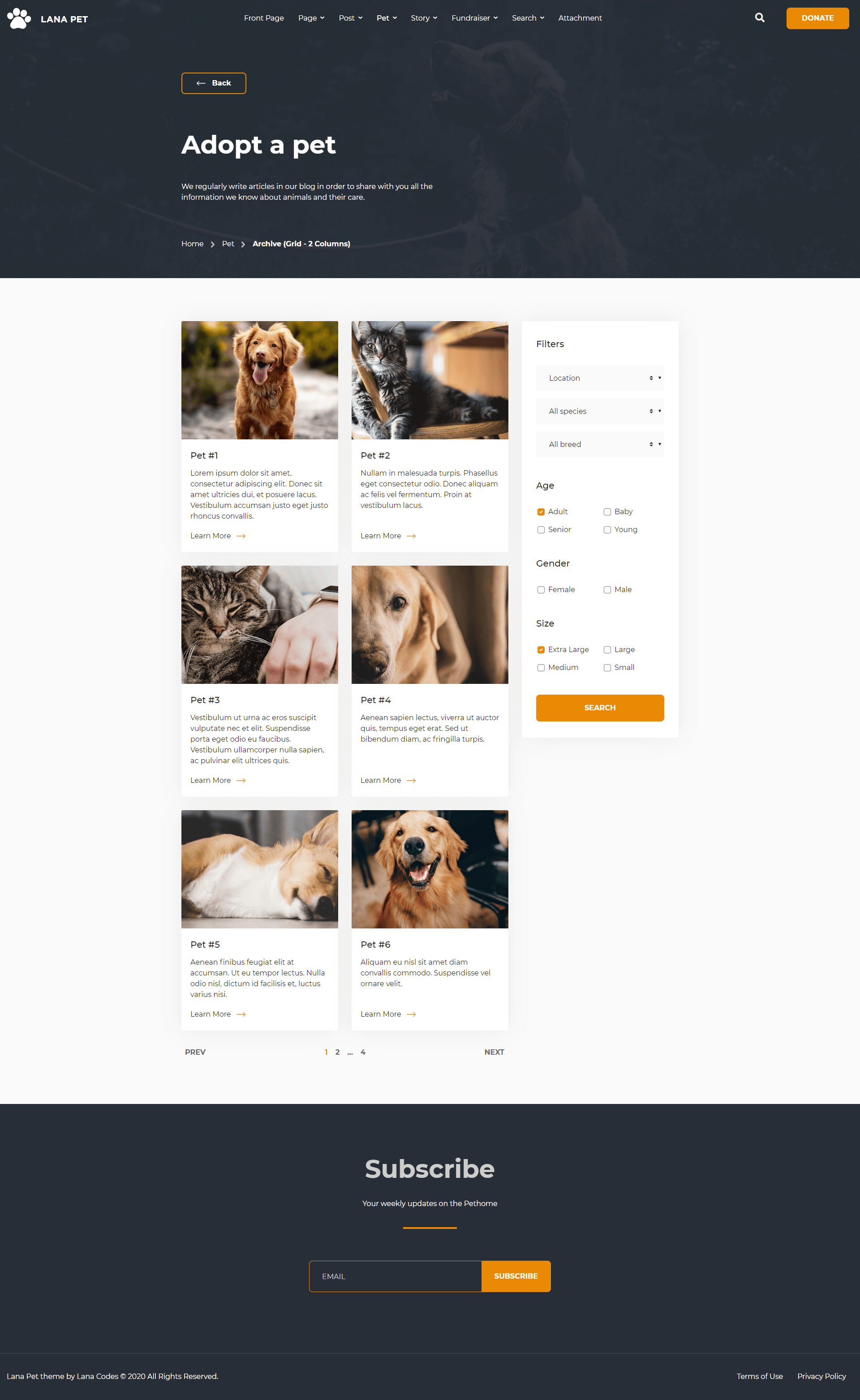
The Pet Archive - Grid with 2 Columns is a content-sidebar structure page.
The main sidebar appears on the right. The sidebar is required to display.
In this case, the structure of the pet will change:
- The featured image on the top of the content.
- Featured image is required. If not set, a placeholder image can be used.
- The location of the pet won't appear.
- The tags of the pet won't appear.
Important classes for the archive-lana_pet-grid-2-columns.html:
                                <body class="archive post-type-archive post-type-archive-lana_pet grid-2-columns">
                                    <!-- body content -->
                                </body>
and the html tag of the posts container:
                                <div class="pet-grid-posts">
                                    <!-- posts -->
                                </div>
and the html tag of the post that contains the content:
                                <div class="pet-grid-col col-12 col-md-6">
                                    <div id="post-1" class="lana_pet type-lana_pet post-1 card pet-grid-card h-100">
                                        <!-- post content -->
                                    </div>
                                </div>
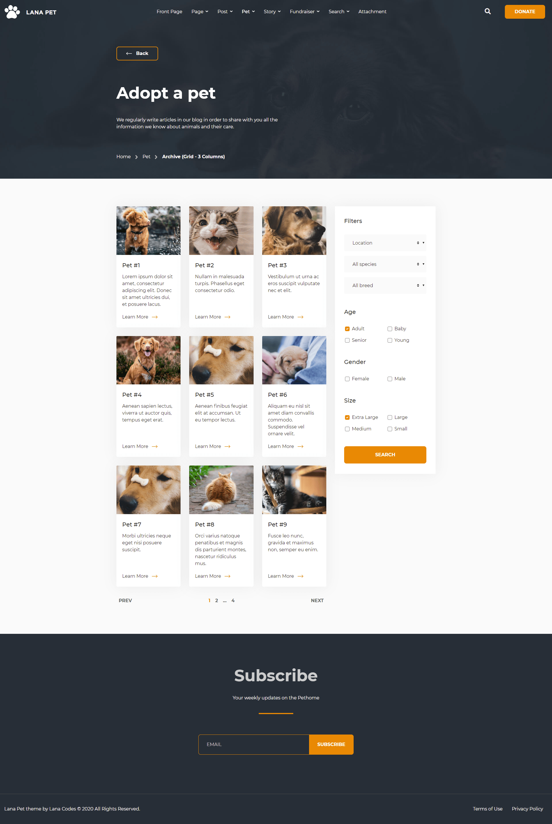
The Pet Archive - Grid with 3 Columns is a content-sidebar structure page.
The main sidebar appears on the right. The sidebar is required to display.
In this case, the structure of the pet will change:
- The featured image on the top of the content.
- Featured image is required. If not set, a placeholder image can be used.
- The location of the pet won't appear.
- The tags of the pet won't appear.
Important classes for the archive-lana_pet-grid-3-columns.html:
                                <body class="archive post-type-archive post-type-archive-lana_pet grid-3-columns">
                                    <!-- body content -->
                                </body>
and the html tag of the posts container:
                                <div class="pet-grid-posts">
                                    <!-- posts -->
                                </div>
and the html tag of the post that contains the content:
                                <div class="pet-grid-col col-12 col-md-6 col-xl-4">
                                    <div id="post-1" class="lana_pet type-lana_pet post-1 card pet-grid-card h-100">
                                        <!-- post content -->
                                    </div>
                                </div>
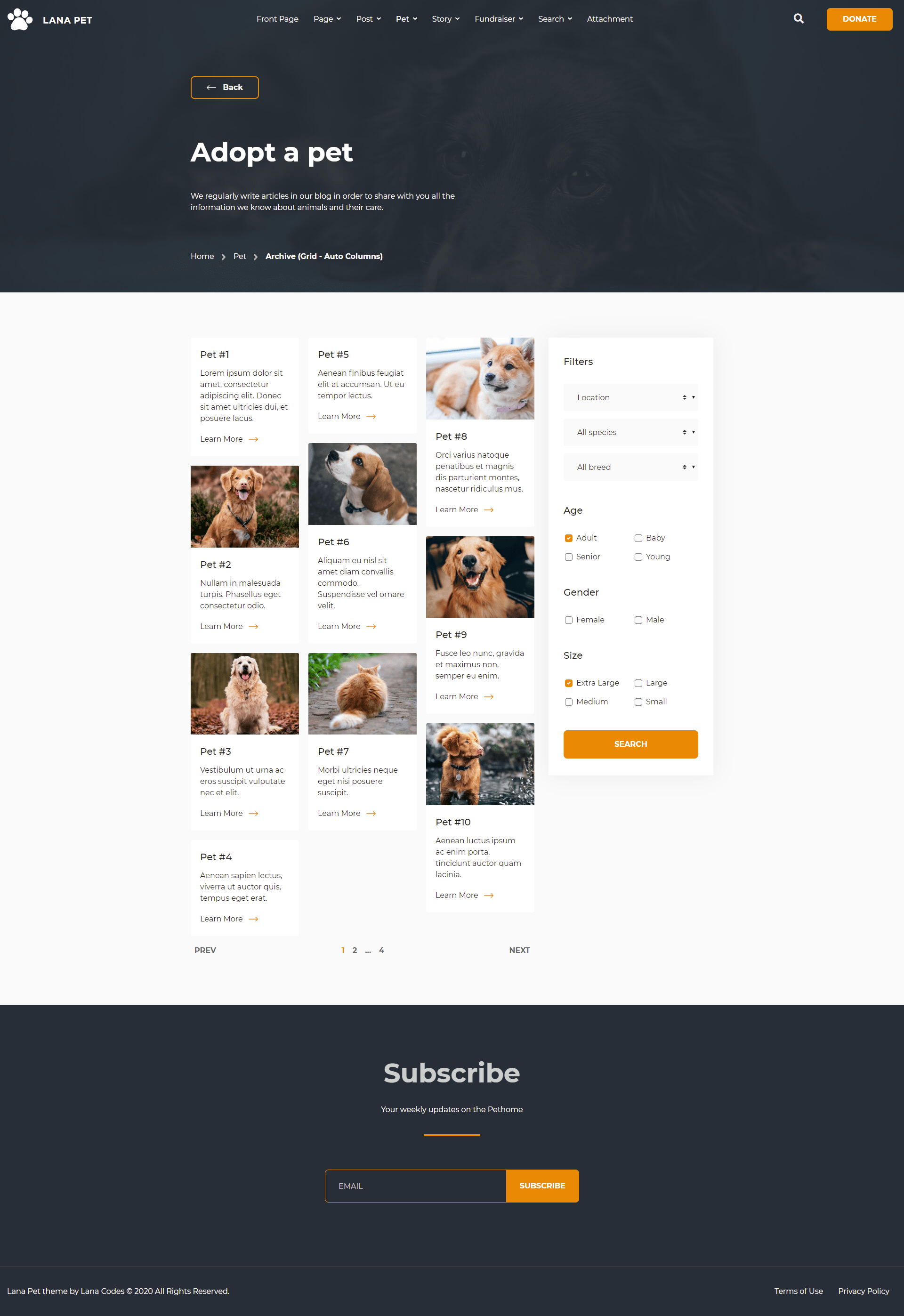
The Pet Archive - Grid with Auto Columns is a content-sidebar structure page.
Cards can be organized into Masonry-like columns with just Bootstrap based CSS.
The main sidebar appears on the right. The sidebar is required to display.
In this case, the structure of the pet will change:
- The featured image on the top of the content.
- Featured image is required. If not set, a placeholder image can be used.
- The location of the pet won't appear.
- The tags of the pet won't appear.
Important classes for the archive-lana_pet-grid-auto-columns.html:
                                <body class="archive post-type-archive post-type-archive-lana_pet grid-auto-columns">
                                    <!-- body content -->
                                </body>
and the html tag of the posts container:
                                <div class="pet-grid-posts">
                                    <div class="card-columns">
                                        <!-- posts -->
                                    </div>
                                </div>
and the html tag of the post that contains the content:
                                <div class="pet-grid-col">
                                    <div id="post-1" class="lana_pet type-lana_pet post-1 card pet-grid-card h-100">
                                        <!-- post content -->
                                    </div>
                                </div>
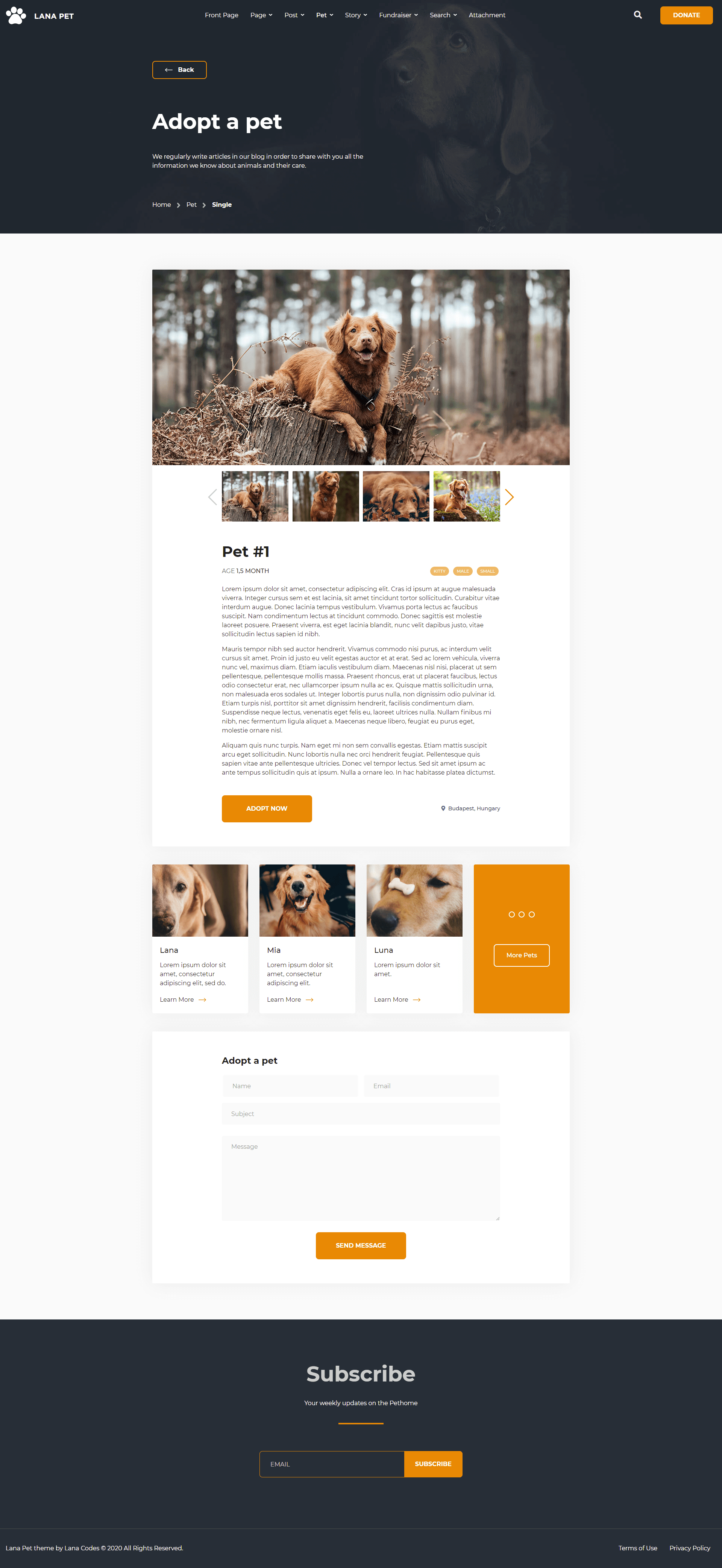
Single
The Featured Image is on the top of the post, in fixed size.
Gallery at the top of the content.
More pets at the bottom of the post.
Adopt a pet (form) at the bottom of the post.
The main sidebar won't appear.
Important classes for the single-lana_pet.html:
                                <body class="single single-lana_pet">
                                    <!-- body content -->
                                </body>
and the html tag of the post that contains the content:
                                <div id="post-1" class="lana_pet type-lana_pet post-1">
                                    <!-- post content -->
                                </div>
Story
The "Lana Pet" theme includes Story custom post type.
Archive
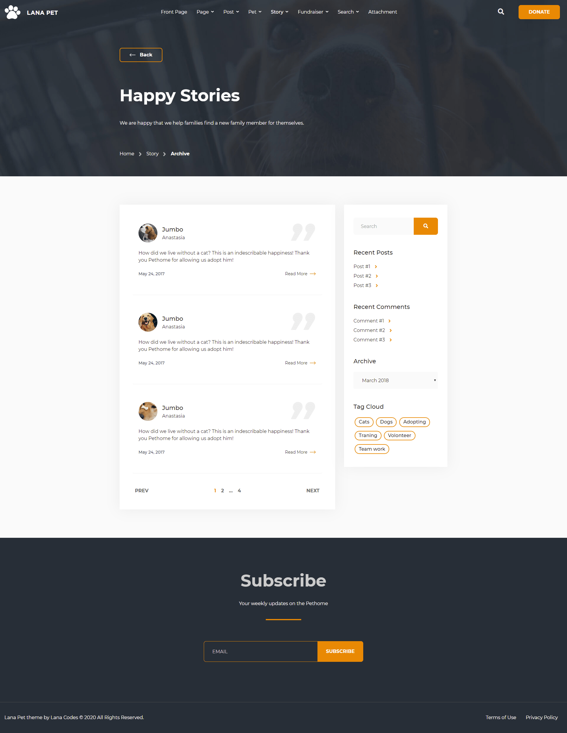
The Story Archive is a content-sidebar structure page.
The main sidebar appears on the right. The sidebar is optional to display.
The featured image is optional for story.
Important classes for the archive-lana_story.html:
                                <body class="archive post-type-archive post-type-archive-lana_story">
                                    <!-- body content -->
                                </body>
and the html tag of the post that contains the content:
                                <div id="post-1" class="lana_story type-lana_story post-1 card story-card">
                                    <!-- post content -->
                                </div>
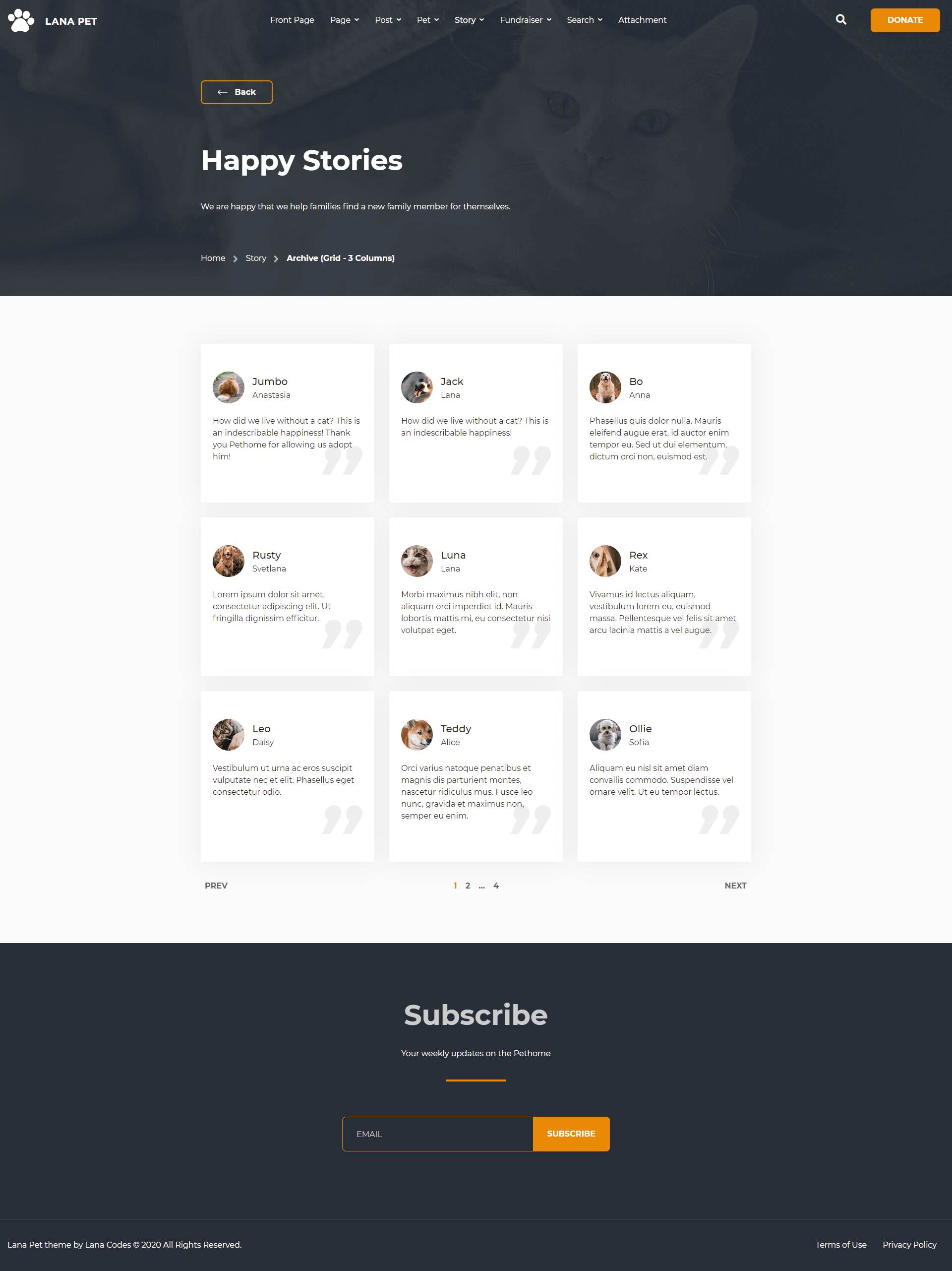
The Story Archive - Grid with 3 Columns is a full-width page.
In this case, the structure of the story will change:
- The whole story card will be a link..
- The "Read More" link won't appear.
- The date of the post won't appear.
Important classes for the archive-lana_story-grid-3-columns.html:
                                <body class="archive post-type-archive post-type-archive-lana_story grid-3-columns">
                                    <!-- body content -->
                                </body>
and the html tag of the post that contains the content:
                                <div class="story-grid-col col-12 col-md-6 col-lg-4">
                                    <div id="post-1" class="lana_story type-lana_story post-1 card story-card story-grid-card h-100">
                                        <!-- post content -->
                                    </div>
                                </div>
Single
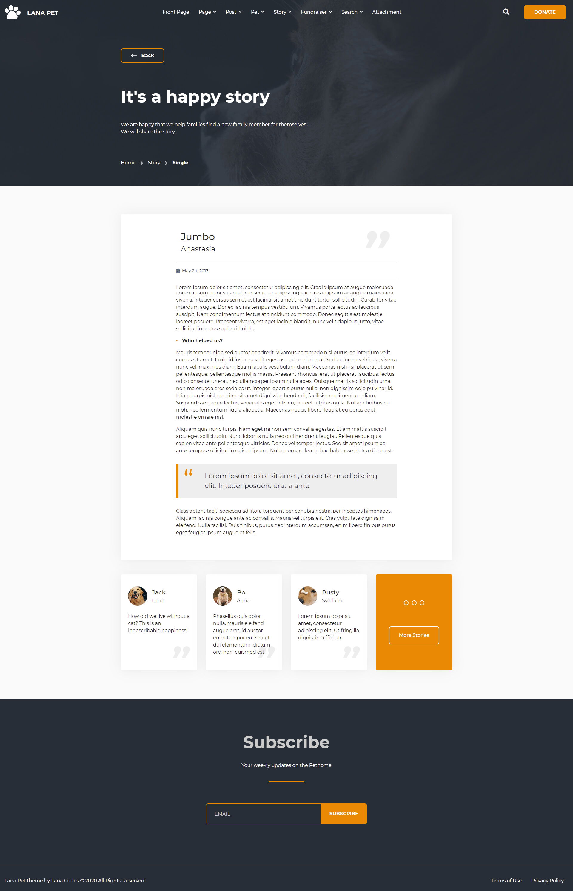
The title consists of two parts: the name of the pet at the top and the name of the owner at the bottom.
The Featured Image is on the left of the title, in fixed size.
More stories at the bottom of the post.
The main sidebar won't appear.
Important classes for the single-lana_story.html:
                                <body class="single single-lana_story">
                                    <!-- body content -->
                                </body>
and the html tag of the post that contains the content:
                                <div id="post-1" class="lana_story type-lana_story post-1">
                                    <!-- post content -->
                                </div>
Fundraiser
The "Lana Pet" theme includes Fundraiser custom post type.
Archive
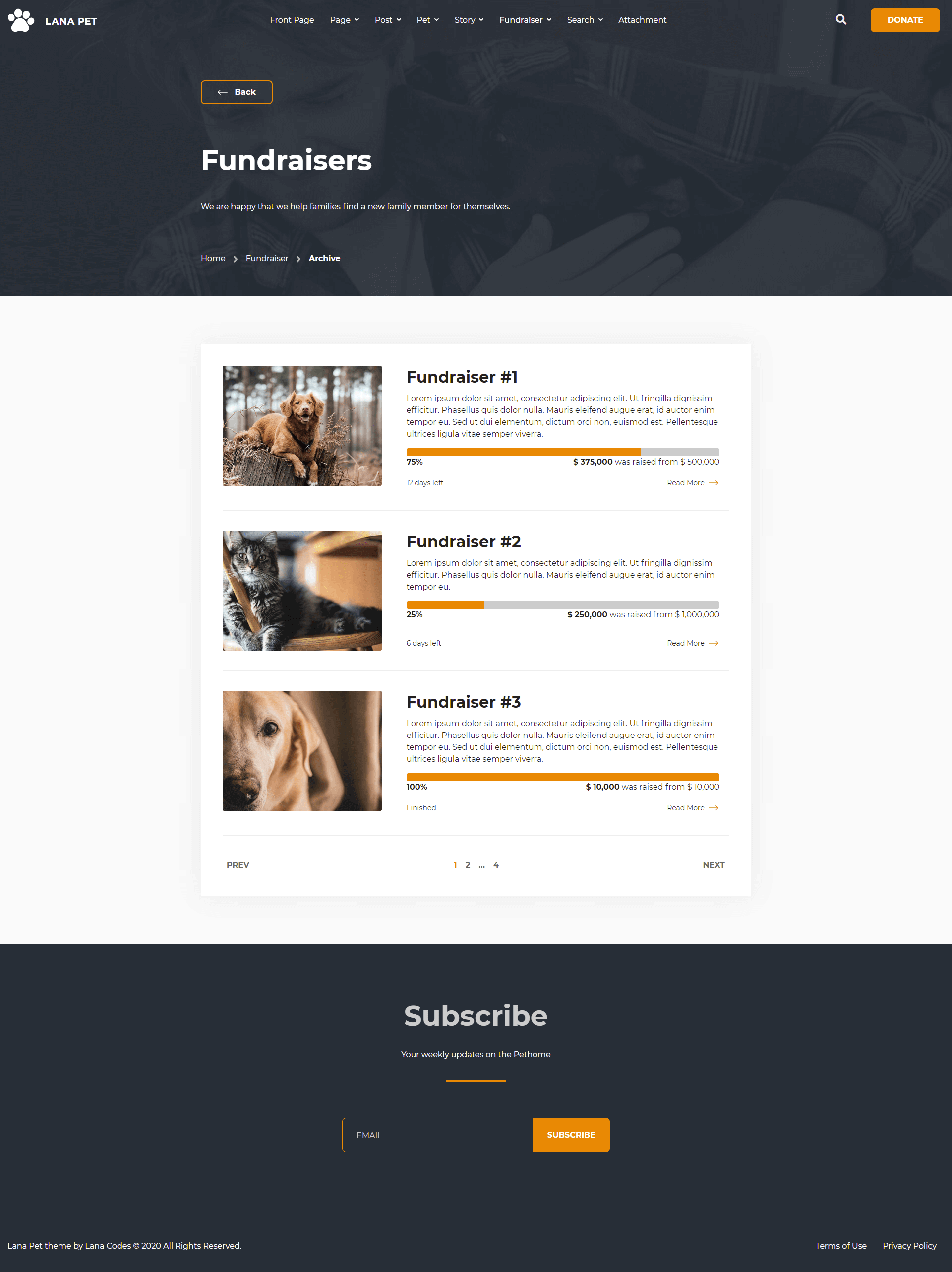
The Fundraiser Archive is a full-width page.
Featured image is required. If not set, a placeholder image can be used.
Important classes for the archive-lana_fundraiser.html:
                                <body class="archive post-type-archive post-type-archive-lana_fundraiser">
                                    <!-- body content -->
                                </body>
and the html tag of the post that contains the content:
                                <div id="post-1" class="lana_fundraiser type-lana_fundraiser post-1 card fundraiser-card">
                                    <!-- post content -->
                                </div>
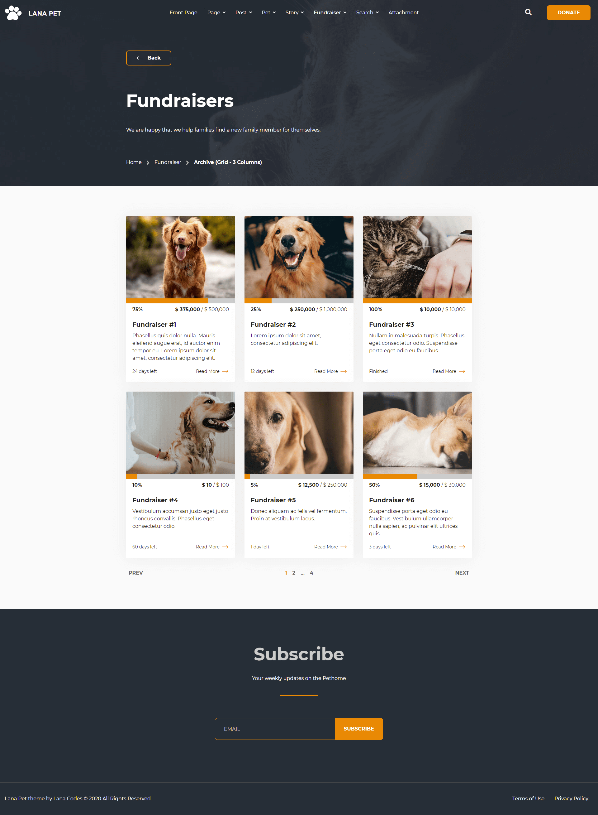
The Fundraiser Archive - Grid with 3 Columns is a full-width page.
In this case, the structure of the fundraiser will change:
- The raised counter will be simpler.
Important classes for the archive-lana_fundraiser-grid-3-columns.html:
                                <body class="archive post-type-archive post-type-archive-lana_fundraiser grid-3-columns">
                                    <!-- body content -->
                                </body>
and the html tag of the post that contains the content:
                                <div class="fundraiser-grid-col col-12 col-md-6 col-lg-4">
                                    <div id="post-1" class="lana_fundraiser type-lana_fundraiser post-1 card fundraiser-card fundraiser-grid-card h-100">
                                        <!-- post content -->
                                    </div>
                                </div>
Single
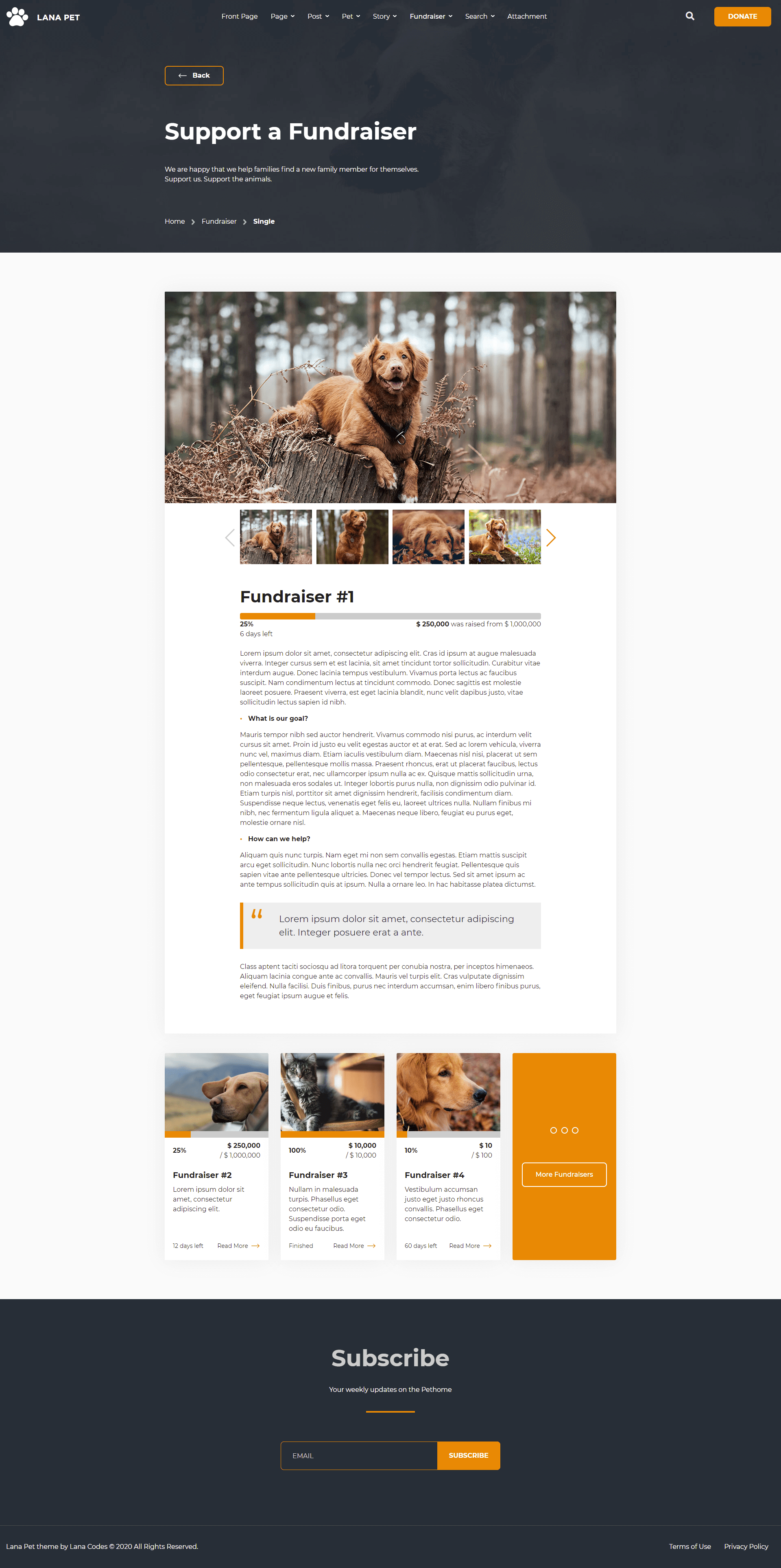
The Featured Image is on the top of the post, in fixed size.
Gallery at the top of the content.
Progress bar and status at the top of the content.
More fundraisers at the bottom of the post.
The main sidebar won't appear.
Important classes for the single-lana_fundraiser.html:
                                <body class="single single-lana_fundraiser">
                                    <!-- body content -->
                                </body>
and the html tag of the post that contains the content:
                                <div id="post-1" class="lana_fundraiser type-lana_fundraiser post-1">
                                    <!-- post content -->
                                </div>
Search
Search Result
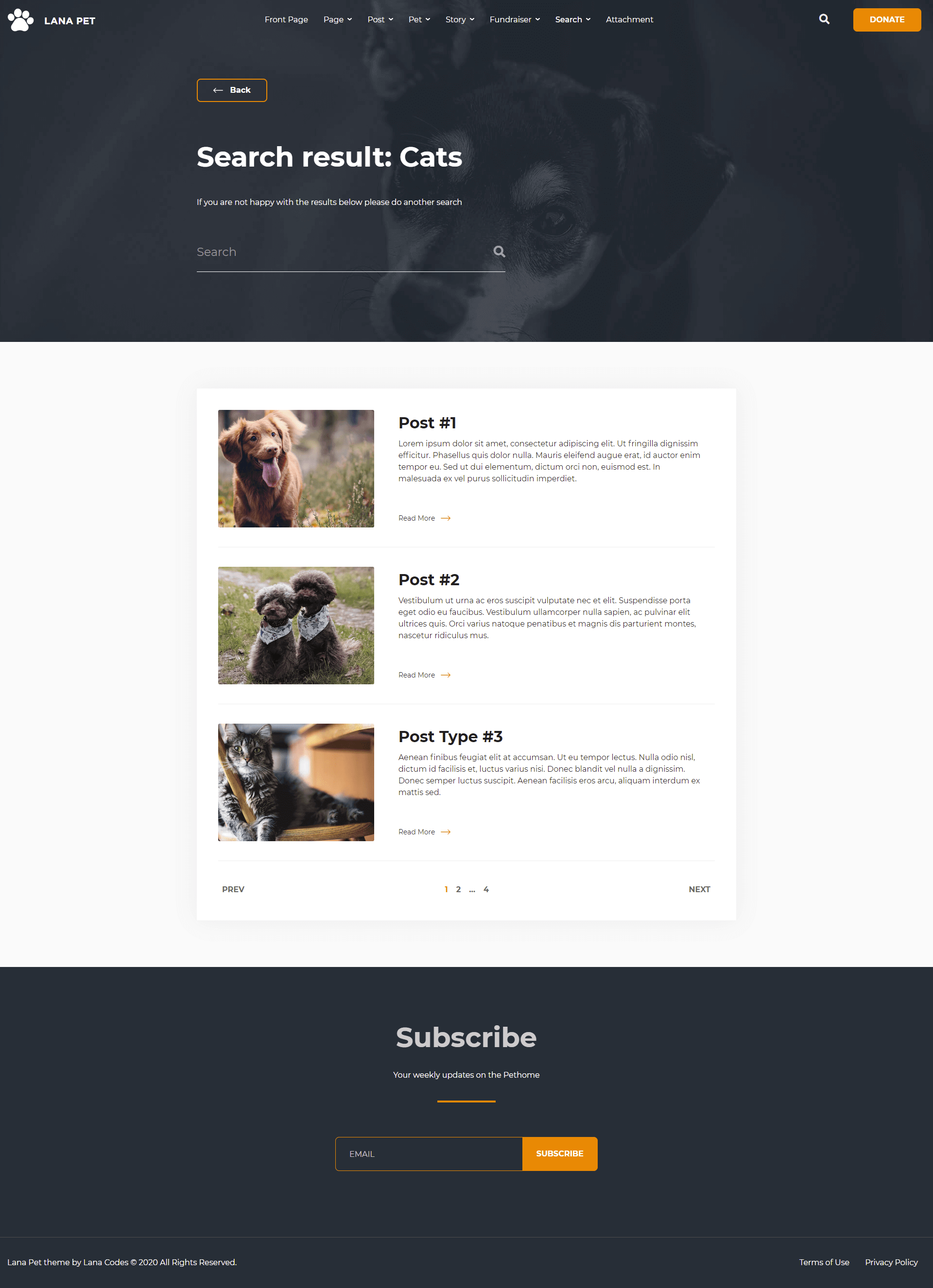
The Search Result template is a full-width page.
The Search Result template includes a search form.
Displays all search results. Displays all post types, such as post, pet, page, etc.
Important classes for the search.html:
                                <body class="search search-results">
                                    <!-- body content -->
                                </body>
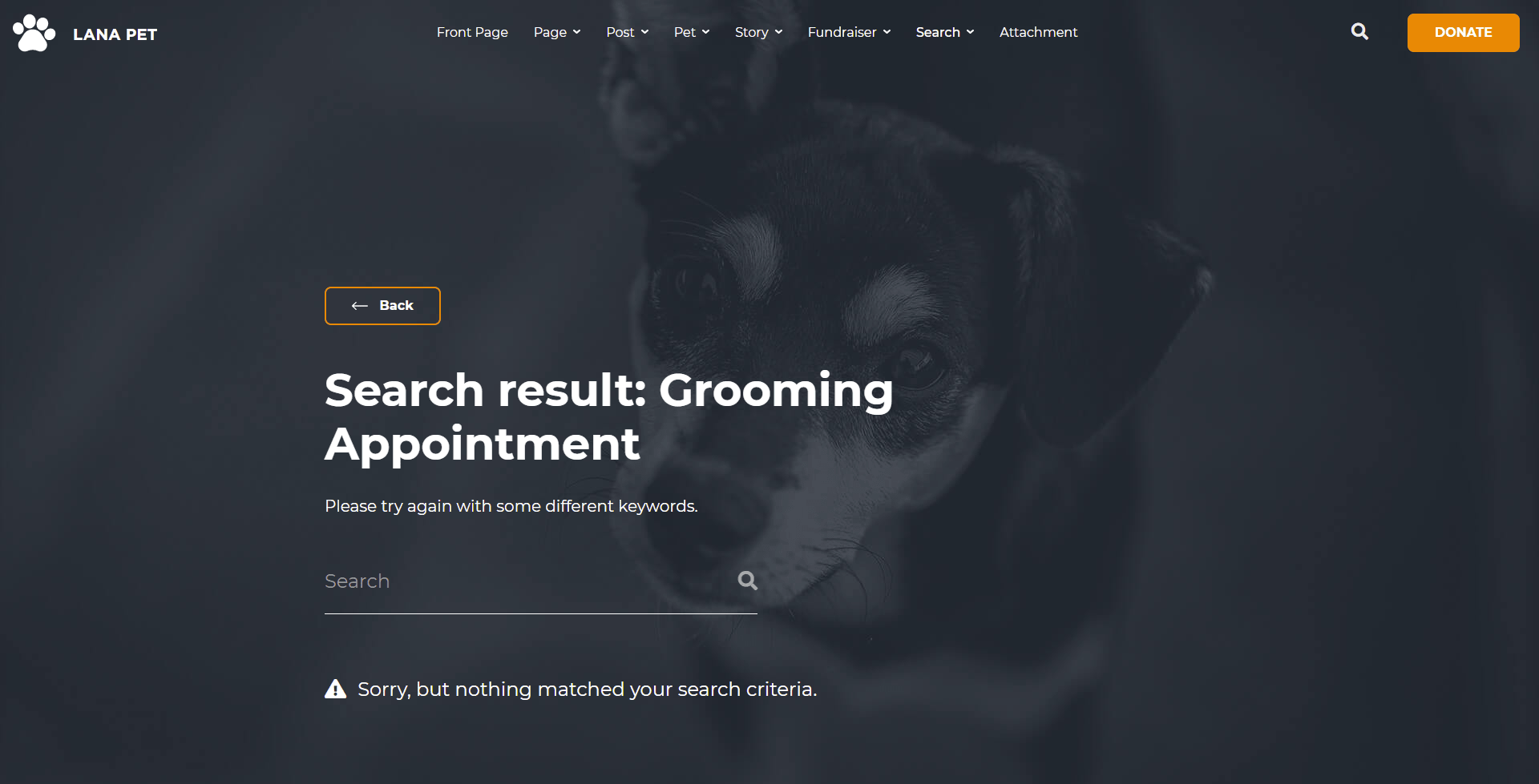
Search No Results
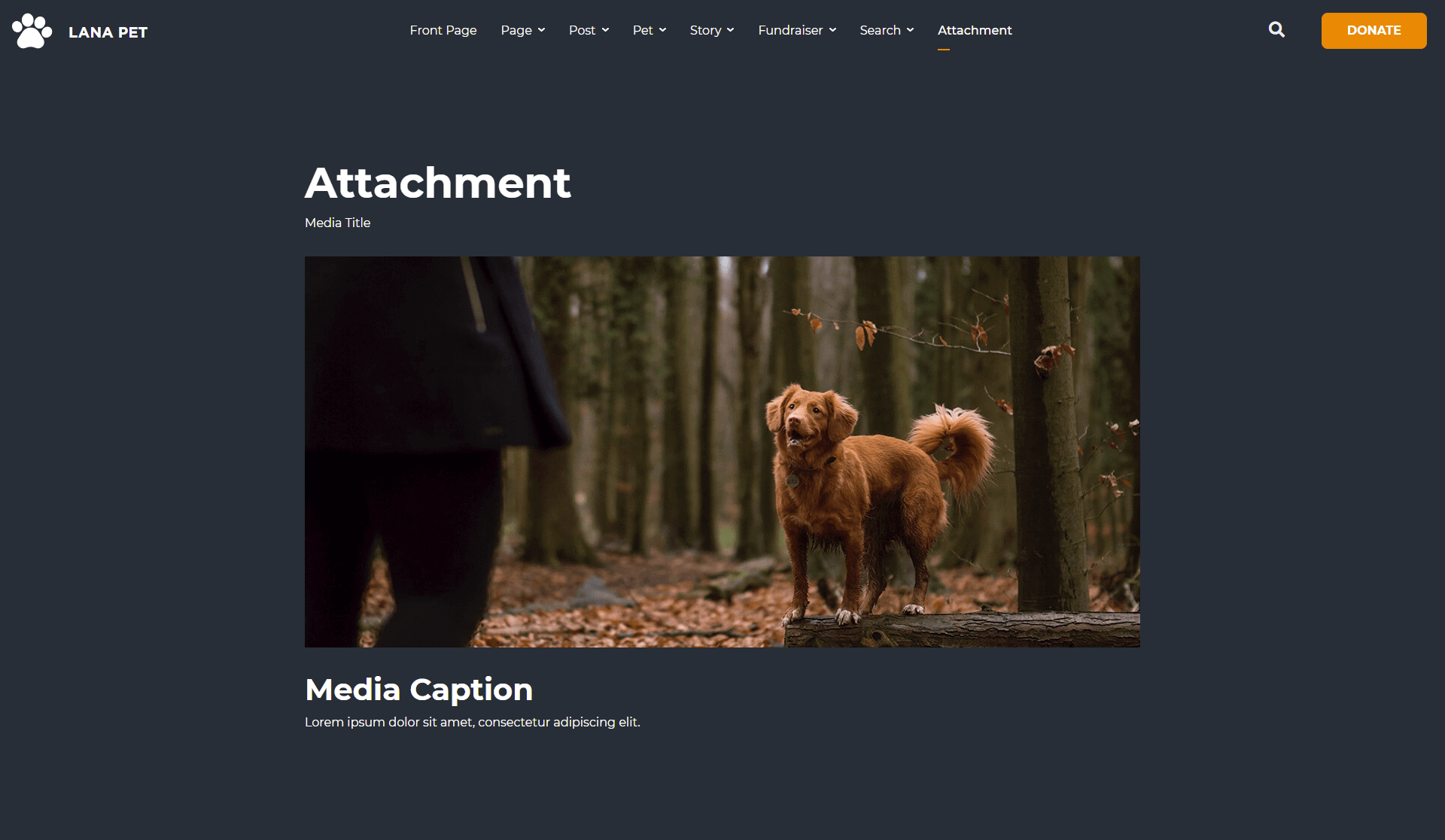
Attachment
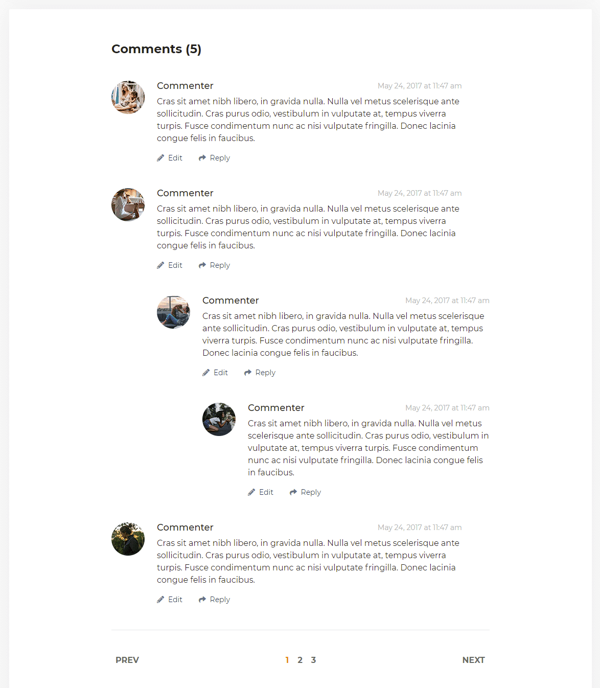
Comment
Icons
Lana Pet Icon
"Lana Pet" contains a set of animal icons.
Example usage:
<span class="lpi lpi-dog lpi-5x"></span>
The full list of icons can be found in the lana-pet-icon.html file in the template.
Or online at https://lana.solutions/lana-pet-html/html/lana-pet-icon.html.
Font Awesome
Font Awesome is a multipurpose icon set.
Example usage:
<i class="fas fa-brush"></i>
Full documentation is available at https://fontawesome.com/.
Backgrounds
Lana Pet Background
"Lana Pet" contains a set of animal backgrounds.
Example usage:
use in header:
<div class="header lana-bg-image-beige-medium-lying-dog-and-cat-body-outdoor"></div>
or use in body:
<body class="lana-full-bg-image-golden-large-sitting-dog-body-indoor"></body>
The full list of backgrounds can be found in the lana-pet-background.html file in
the template.
Or online at https://lana.solutions/lana-pet-html/html/lana-pet-background.html.
Credits
Bootstrap: http://getbootstrap.com/
jQuery: http://jquery.com/
Swiper: https://swiperjs.com/
Animate CSS: https://daneden.github.io/animate.css/
Font Awesome: http://fortawesome.github.io/Font-Awesome/
Smartmenus: https://www.smartmenus.org/
Holder.js: http://holderjs.com/
Icons from Icongeek26, Freepik.
Web fonts from Google.
